
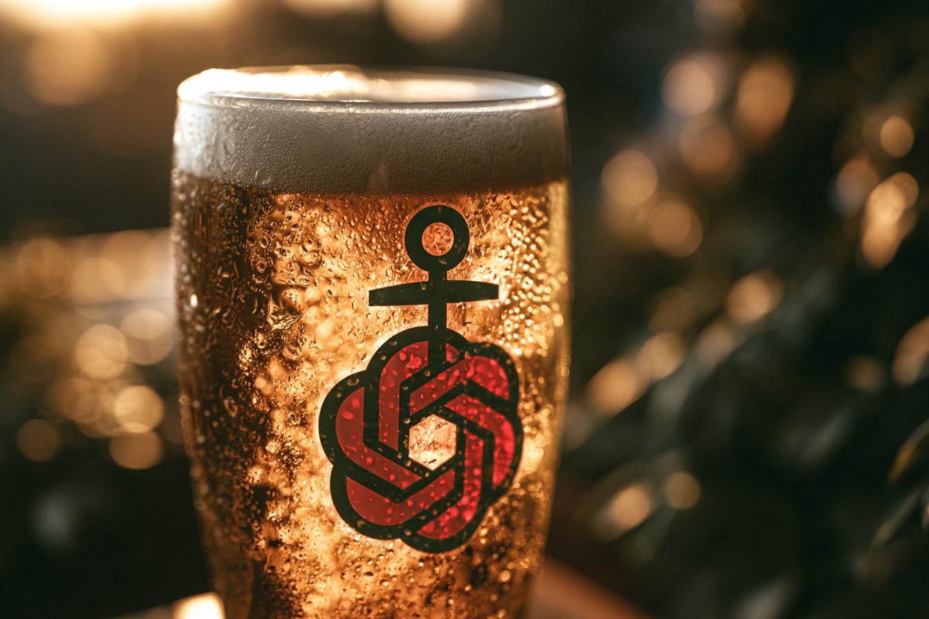
GPT Astra in the taste test
In Germany, when people hear ‘Astra’, they immediately think of beer.
This association is no coincidence. Over the years, the Hamburg-based beer brand of the same name has cemented itself in people’s minds through provocative, unconventional and humorous marketing. The beer itself is almost secondary – yet the brand sticks in the mind: with self-deprecating humour and the aim of not trying to please everyone.
Nowadays, when people hear ‘Astra’, they might no longer think just of beer, but also of OpenAI’s latest language model, GPT Astra. The similarity in names was a welcome opportunity for us to bring both worlds together in a Centigrade LowCoder workshop: beer as the central theme and GPT Astra as the tool. Several teams were tasked with developing an app that provides users with spontaneous suggestions for brewery events. The Open Brewery Database served as the data source, with its data processed automatically via an n8n workflow.
The starting point was ideal for creative diversity: the same user requirement, the same data and the same AI tool.
Exploration on Fast Forward
The result was surprising: instead of six different product ideas, six remarkably similar applications emerged. Map, filters, event list, generated branding. The solutions looked polished, worked at first glance and were produced in a very short time.
Within a matter of minutes, GPT Astra generated logos, taglines, colour schemes and initial UI concepts. What used to require several workshops, mood boards and design iterations was suddenly available as a clickable design. This is a huge advantage for early-stage exploration: ideas become visible, comparable and open to discussion more quickly.
At the same time, a question arose: if a tool with virtually unlimited possibilities can open up so many potential solutions, why did it still produce such similar results? Given the user need – to discover spontaneous brewery events for a day out – significantly more directions would surely have been conceivable.
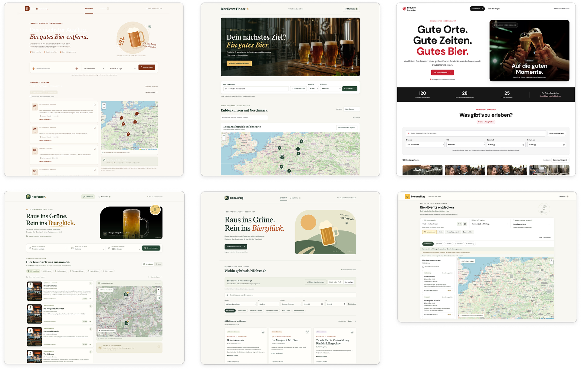
Ready-made branding
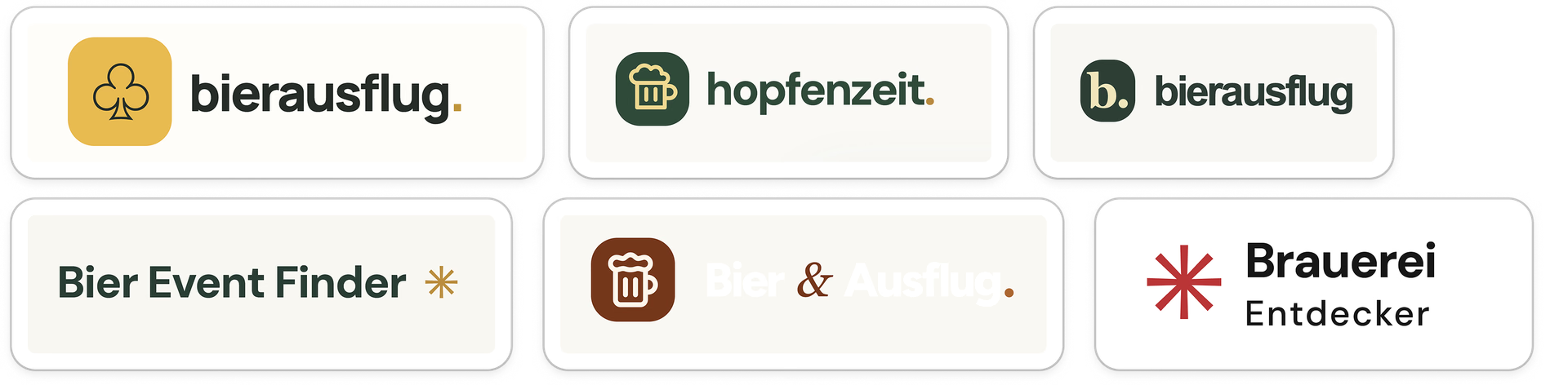
The designs were strikingly similar in terms of their visual style. Brand identity, typography and UI largely followed established patterns: a neutral text font, a contrasting, friendly serif font for headlines, and generic beer or star logos as supposed brand anchors, which ultimately remained very interchangeable.
As expected, the colour palette ranged from hoppy greens to beer-inspired shades, from mustard yellow to rust red. The details, however, were less convincing: White text on light backgrounds repeatedly resulted in insufficient contrast, whilst inconsistent radii disrupted the visual unity of the components. Neither of these is merely a cosmetic flaw: a lack of contrast impairs accessibility, whilst jagged edges make the UI appear cluttered and unfinished.
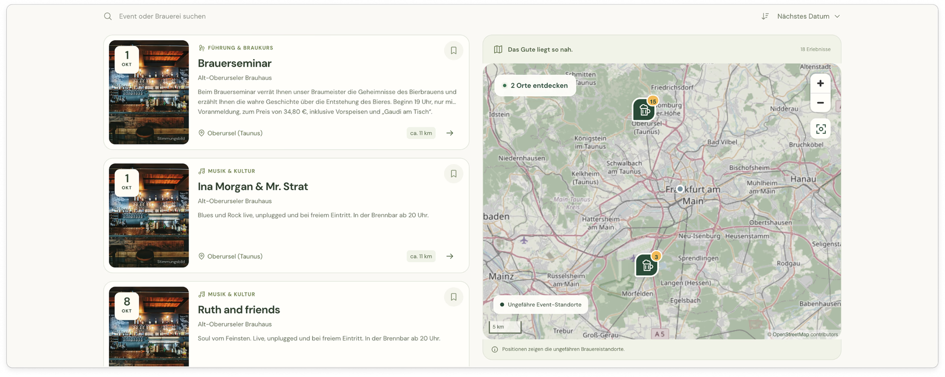
Although the solutions otherwise appeared largely sound, there was a general lack of clear differentiation or a consistent, well-thought-out system. Within the interface, this manifested as an information architecture that was always the same, consisting of a map, filter mechanism and event list. The AI optimised for the familiar rather than for originality.
The process starts before the first prompt
Most teams adopted GPT Astra early on as a tool for generating screens, rather than first questioning the requirements, assumptions and the quality of the data set. It became apparent that many conceptual issues could have been clarified even before the first interface was designed.
In my view, this is precisely where the more exciting use case for AI lies: not as a designer or expert, but as a sparring partner that helps to highlight gaps in information, contradictions and uncertain assumptions. The more clearly the starting point is defined, the less the model has to improvise.
The comparison became particularly interesting where the results differed more markedly from one another despite a similar starting point. These differences did not arise from the data or requirements, but rather where participants consciously added their own ideas and built on what already existed. A small button featuring the audio track ‘Hopfenwalzer’ was a good example of this. Not a central function, but a detail with character. Compared to the other designs, this approach stuck in the memory because it told its own story and gave the product personality.
Conclusion: AI speeds up the exploration process. This makes the thinking process all the more important.
Astra is not a strong brand because everyone likes it. It is a strong brand because, over the years, decisions were made about who it does not have to appeal to.
A language model does not make such decisions. Without a clear direction, it usually ends up with the most likely result. The most exciting ideas from the workshop therefore emerged where people deliberately deviated from the expected.
AI can now generate logos, branding, prototypes and interfaces within minutes. This shifts the bottleneck in the design process: away from the creation of the prototype, and towards the design of the process that precedes it.
For designers, this does not mean less responsibility, but more. Good design does not arise from the next optimised prompt, but from clear requirements, well-thought-out systems and deliberately set boundaries. AI does not replace this work. It makes the shortcomings more visible.
This process is, at its core, the actual design work. It not only produces more consistent results but also sharpens the ability to evaluate them. This judgement is developed through research, discussion, comparison and conscious deliberation – by engaging with the problem before a solution even emerges.
Anyone who skips this stage saves time during production, but also misses out on the part where one learns why a solution works, when it fails, and how to recognise good design.
The best interfaces therefore do not result from better prompts. They result from a better process prior to the first prompt.