

Not everyone likes Google products, but everyone who has a computer / laptop / smartphone uses them. It’s really fascinating how a company founded by two students conquered a huge part of the market, became the most desired employer, and every year continue to surprise us with highly innovating ideas. And it’s even more fascinating how a company with about 60.000 employees apparently can’t afford good user interfaces (UI).

Google is a trademark or registered trademark of Google Inc. in the US and/or other countries.
As a visual designer and a perfectionist I like to get aesthetic enjoyment out of the products I use. But Google never delights us with eye candies, wow-effects or anything like that. Maybe because they deliberately decided to put content first. The Google search UI looks now much better than six years ago, but the only word which comes to my mind when I look at it is “sterile”.

Google is a trademark or registered trademark of Google Inc. in the US and/or other countries.
You may say therefore that Google’s UI is clean, clear and usable, but is it really? At Centigrade designers do reviews with colleagues to find things that could be improved in their work. So I would like to bring to your attention a small review of Google’s UI. I’ve chosen Google search as a well-known and simple product to find out whether something can be done better.
General issues
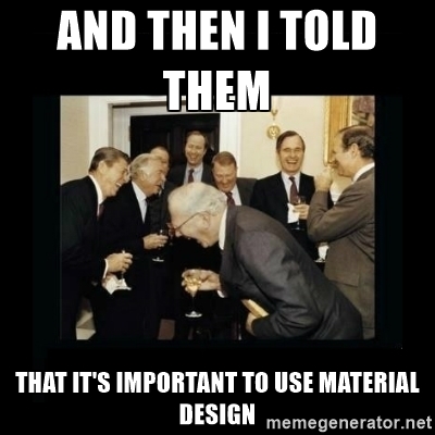
1. Is it material? I’m a big fan of Google material design and try to apply it in my work wherever it’s possible. But why Google doesn’t use its own guidelines? For example I’m pretty sure these buttons could be “Raised buttons”.

Google is a trademark or registered trademark of Google Inc. in the US and/or other countries.
2. Accessibility. Obviously those buttons don’t have enough contrast and readability could be better. But let’s check them with WebAIM – a great, well-known tool which allows us to check color contrast text/background according to Web Content Accessibility Guidelines (WCAG) 2.0.

Google is a trademark or registered trademark of Google Inc. in the US and/or other countries.
No comments.
“Google search” and “I’m feeling lucky” buttons
To return to the buttons again: they really raise a lot of questions. It’s the first thing you see on the start page, but why were they placed there? The user is never able to click them. No, really! Try it! You can click on the “Google search” and “I’m feeling lucky” buttons when the search field is empty, but for the first button it’s useless as it doesn’t produce any results. The second button will lead you to something very different (the doodles page). But once you start typing something in the search field you will be brought to a search results page and the buttons are not there anymore.

Google is a trademark or registered trademark of Google Inc. in the US and/or other countries.
Oh, and while we’re at it: Why not use some of those fancy animations mentioned in your style guide, Google?
memegenerator.net
Moreover if you checked “Never show Instant results” on the settings page and start typing search query on the main page you won’t be able to click those buttons anyway because they will be substituted with other buttons:

Google is a trademark or registered trademark of Google Inc. in the US and/or other countries.
So why are they there?!
Search results page
1. Search field. You can’t clear your query in one click. I’m not kidding. A “clear” button in a search field is a standard de-facto in UI design now, but not for Google search. There is no such button. But if you enter Search help you find yourself in a totally different world where everything looks Material, the search fields have “Clear” buttons and people have hope.

Google is a trademark or registered trademark of Google Inc. in the US and/or other countries.
2. Mysterious controls. When you are logged in you can see three buttons in the right top corner – a person, a globe and a gear (only if “Use private results” is checked on the settings page). It took me quite a while to understand their meaning. I’m not an advanced Google user, but I’m a UI designer, so I have some experience with buttons. For a few minutes I have been trying to understand which one is disabled, which one is checked and which one is just in normal state. There is a difference between them, but it’s really subtle. Let’s take a look together.

Google is a trademark or registered trademark of Google Inc. in the US and/or other countries.
The interaction of the “Settings” button is clear – it provides us with a drop down menu. But the couple of two others looks strange. The first one, “Show all results”, seems to be disabled. But it has a hover effect and you can click it to reload the result list. So the question is: if the button is disabled, why is it clickable? And if it is active and contains some interaction, why does it have a different style (the icon has lighter color) from the “Settings” button? The “Currently hiding private results” seems to be selected, but you also can click on it and it reloads the result list again. To be totally honest, I still don’t understand those two buttons.
3. The company card is my favorite part. You get it when you type a company name in the search field. Let’s try “Google” for example:
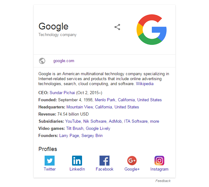
Google is a trademark or registered trademark of Google Inc. in the US and/or other countries.
Looks beautiful, almost material! Nicely organized, interesting information. The one thing which disturbs me is the “more” link in the Subsidiaries row. It’s not even the biggest problem that it looks exactly the same as a Subsidiary name, but rather that it has a strange interaction. Wouldn’t you expect that it simply expands the list? Well, you would be surprised: It actually reloads the page for literally no reason (the content stays the same afterwards) and adds a huge black slider at the top. Why? Only Google knows. But the most unexpected thing is that you can’t even close the slider, no matter how much you might despise it! And you still can click that “more” link, because it’s still there, even if you see the VERY prominent list of Subsidiaries already.

Google is a trademark or registered trademark of Google Inc. in the US and/or other countries.
Of course, this is a highly specific criticism. Google’s interfaces are extremely clear and intuitive. But since it is such a high level company with tremendous human and financial resources I’m confident that they can take it.
Success is never blamed, but I also believe that there’s nothing that can’t be improved. And I hope one day when I visit google.com I’ll get real aesthetic pleasure. For me that will mean that finally they are the best in everything they do!
