

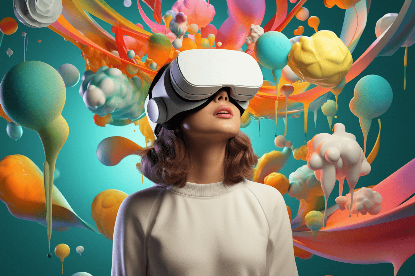
With the announcement of Apple Vision Pro, Apple says it has taken the world of mixed reality (MR), i.e. augmented reality (AR) and virtual reality (VR), to a whole new level. Software providers, developers and designers now have the exciting opportunity to develop spatial applications that seamlessly connect the physical and digital worlds.
This means that we as designers have to open up new dimensions of design and interaction.
I have been working intensively on Spatial Design, the information already known about Apple Vision Pro and the design guidelines published by Apple.
In this article, I will focus on Apple Vision Pro and the Apple Spatial Design principles and guidelines. I will shed light on the new possibilities that are opening up, but also on the challenges that will arise for us concept designers when developing spatial apps.
So let’s dive into augmented reality and find out how we can create new, immersive user experiences.
What does AR, VR or MR mean?
First of all, I would like to briefly explain the basics:
- VR stands for virtual reality. VR glasses are therefore screen glasses that transport users to a different, virtual place.
- AR: stands for augmented reality. AR glasses are therefore glasses that expand or enrich reality for the user through overlays.
- MR: stands for mixed reality, sometimes also referred to as hybrid reality. This is when reality is enhanced by virtual components in such a way that the virtual components become a real-looking and real-behaving part of the perceived reality.
- XR, or Extended Reality (beware of confusion when translating into German!), is a newly emerging term that is intended to unite all the terms described above.
But now to the Apple Vision Pro and the question of where it fits in.
Apple Vision Pro

Before we get into principles and guidelines, it’s important to understand the fundamental aspects of Apple Vision Pro.
According to Apple, users have a limitless canvas on which we as designers can seamlessly offer virtual interactive content. The connection to the physical environment should remain intact and only be completely disconnected if necessary.
Apple has realised this by equipping the Vision Pro with sophisticated camera and processor technology that films the environment and can display it on the glasses’ screen in real time. This can only be done in certain areas in order to combine reality and virtuality.
Let’s now take a closer look at the main features advertised by Apple::
Spatial perception
Apple Vision Pro is designed to provide a limitless canvas on which users can interact with virtual content such as windows, volumes and 3D objects. This spatial freedom opens up endless possibilities for creative experiences and interactions.
Immersion
One of the outstanding features of VisionOS will be the ability to switch between different levels of immersion. Apps should be able to be started in a shared space in which several apps can run side by side. However, it should also be possible to enter a full space in which a single app takes centre stage.
Watch through
Pass Through mode provides users with live video from the device’s external cameras, allowing them to interact with virtual content while maintaining a connection to their physical environment. Users can control the pass through level using the Digital Crown, allowing them to maintain control of their environment.
Spatial sound
Apple Vision Pro combines acoustic and visual sensor technologies to create natural sound in the user’s environment. Apps can retrieve information about the user’s environment and adjust the sound accordingly to improve the overall immersion.
Focus and gestures
Interaction with Apple Vision Pro is mainly based on the user’s eyes and hands. Users can focus on virtual objects to activate them, often using indirect gestures such as tapping or direct gestures such as touching objects with their fingers. This unique input method offers a new way to interact with content.
Ergonomics
To ensure user comfort, Vision OS can automatically position content relative to the wearer’s head, regardless of their size or posture. This eliminates the need for users to constantly adjust their position to access content, allowing for a more relaxed and enjoyable experience.
Accessibility
Accessibility is a top priority for Apple Vision Pro, with support for technologies such as VoiceOver, Switch Control, Dwell Control, Guided Access, Head Pointer and more. This ensures that all users, regardless of ability, can enjoy the platform. System-provided UI components have built-in accessibility support, making it easier for developers to create inclusive experiences.
Eye Sight
The see-through mode of the glasses enables users to see people in their surroundings and therefore interact with them. One major problem with this is that the lack of eye contact makes it difficult for these people to have natural conversations. Apple has therefore equipped the Vision Pro with a mechanism that creates artificial transparency in the glasses.
The glasses are equipped with an external display that shows a picture of the eyes and thus allows a feeling of eye contact. Overall, an effort has been made to make the glasses look as minimal as possible, which is certainly also due to the organic shape of the glasses.

It remains to be seen to what extent the Apple Vision Pro will be convincing from a technical perspective. Rumours are circulating online, for example, that the width of the field of view, which is one of the biggest shortcomings of the current generation of XR headsets, will not be any wider than the headsets currently available on the market, despite the hefty price tag. Overall, the insight Apple has given us so far is very limited in many details. There have only been a few people outside the manufacturer who have been allowed to try out the device, behind closed doors of course.
In any case, expectations are high; let’s hope that Apple fulfils them. From a technical point of view, we know that the glasses, weighing around 450 grams (excluding the external battery), will not be significantly lighter than the currently established systems. Even with an integrated battery, many competing devices are hardly any heavier. The battery is said to have a runtime of 2 hours and can be charged via USB-C.
As such a device not only has to impress technically, but also in terms of use, Apple provides us designers and developers with its own design guidelines, which I would like to discuss in the following section.
Principles
Apple summarises the basics of Spatial Design in 5 principles that are intended to help developers and designers create immersive experiences:
- Familiarity
- Human-centred approach
- Dimensionality
- Immersion
- Authenticity
In the following, I will briefly outline and explain Apple’s specifications for each individual principle.
Familiarity
The interface should feel familiar, i.e. “flat apps” that look like the iPad and monitor embedded in the 3D space. This can then be enriched with subtle depth levels to represent hierarchies. The actual content should remain flat as usual. The general appearance should look just as familiar. Icons, spacing and touch surfaces should be modelled on those of the iPad in order to build up this familiarity.
It is advisable to use familiar elements such as sidebars, tabs and search fields to ensure that the user interface remains easily recognisable and operable for users. Windows are treated as part of the environment and should appear to users as a natural part of their environment.
This should provide users with an interface that is familiar, understandable and usable from the outset.
In order to maintain familiarity for existing apps, Apple recommends identifying a core feature of an existing app and utilising it with all the means of spatial design – and only this feature. The rest of the app can fall back on familiar features. In this way, Apple wants to ensure that existing apps continue to work across platforms and that users are gently introduced to the benefits of Spatial Design.
Human-centred approach
The focus of the design should be on how users use the MR headset and the applications running on it. The first thing to consider is the field of vision, i.e. what the user can see at once. The field of vision is usually horizontal and should be centred where the natural focus is. The body posture must also be considered here. When lying on the couch, the field of view can be played higher and at an angle, whereas for someone sitting at a desk, the field of view tends to be slightly lower.
If users change their head position, for example by turning slightly, they should be able to adjust the display accordingly so that it adapts to the new head position. Windows should not follow the user’s gaze when they turn their head, but should be firmly anchored in the real space and can only be repositioned as required.
Windows should not impose themselves by being displayed too close, they should function at a distance and leave space for the user. It is important that they always remain legible and operable despite the distance.
Interactions should not be reinvented, but should be based on familiar interactions. For example, opening or closing the fingers as an interaction to manipulate sizes. Users should be able to operate applications while stationary and not be forced to move around too much.
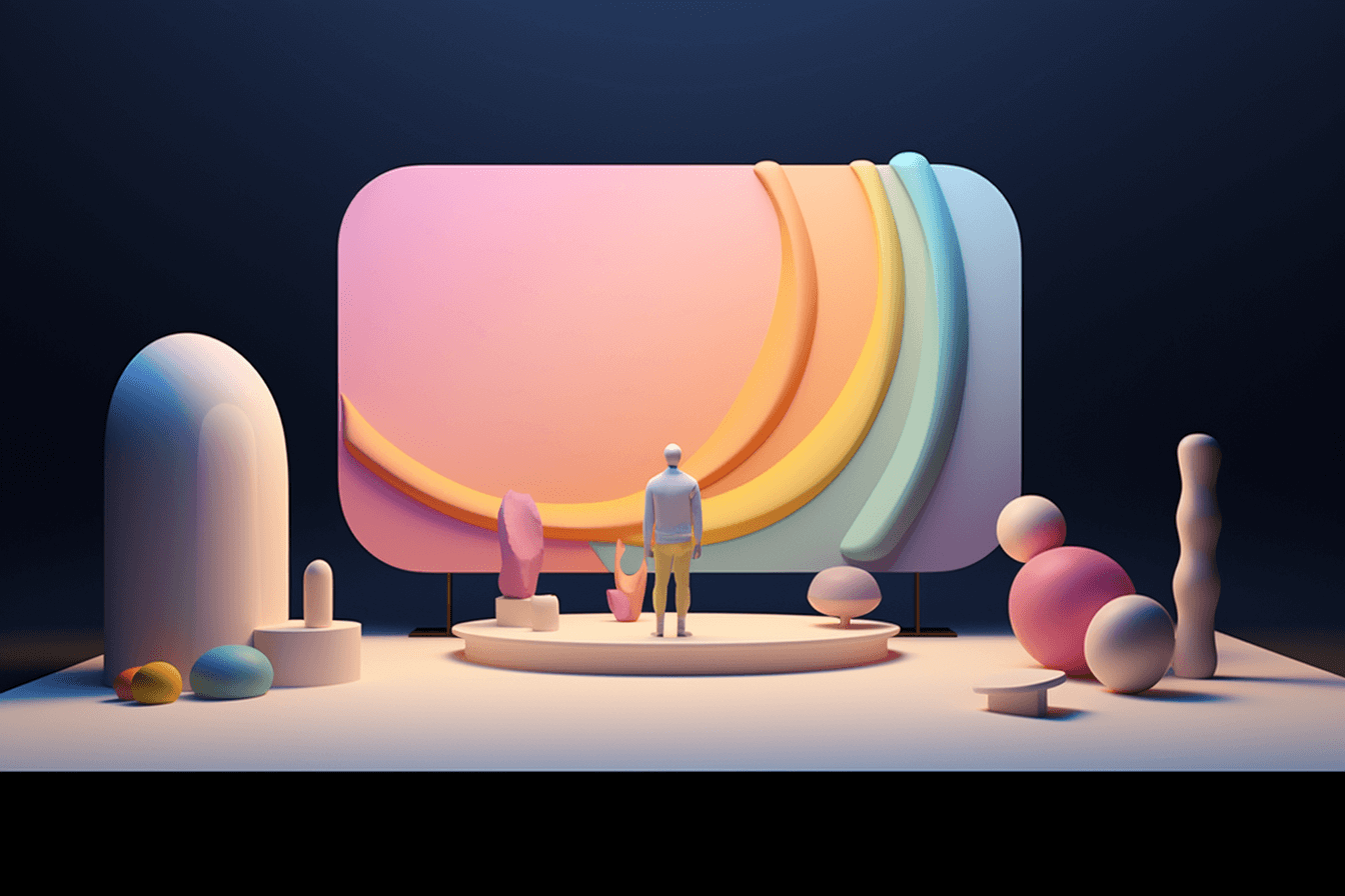
Dimensionality
Spatial apps should make optimum use of the available space and at the same time be flexible enough to function in different environments. This means that apps can be customised in different sizes and spatial arrangements.
Apps must be anchored in real space. Glass materials, whether almost transparent or frosted, are a good choice as they blend into the room and are also well suited to visually connecting elements.
Menu and button bars can be displayed closer to the viewer to make them easier to use, just as the mouse and keyboard are closer than the monitor. Windows and menu elements should cast shadows to give them a more realistic appearance.
To create an even more realistic experience, content should emit light and thus slightly illuminate the room, just as a real display emits light.
Now it becomes somewhat counter-intuitive: windows should become larger when they are displayed further away and correspondingly smaller when they are closer. The best way to compare this is with a cinema screen, which is far away and very large, and the tablet display, which is close and small.
Depth and scaling should be used to influence the hierarchy and focus of the user interface. Objects in the distance can be large and inviting, while close objects invite interaction and can be easily examined. However, too much depth and movement can
Immersion
Immersion can take place on different levels in spatial apps:
A window that floats in front of the user, realistically embedded in the real environment

A panoramic screen that surrounds users 180°

The fully immersive VR experience
Depending on the context, these different levels should be utilised. Browsing apps, for example, should be embedded in the real space and the more you focus, the more the focus should be visually supported. Starting with the darkening of the surrounding room through to the full VR environment.
The audio experience makes a major contribution to immersion. Spatial audio and atmospheric sounds should therefore be used.
Authenticity
The most important point is to develop apps that feel authentic within the platform. This means that apps must be captivating and immersive, as well as meaningful in the context of the device.
In addition to these basic guidelines, Apple has published a video on the topic of spatial interaction, the content of which I would like to discuss in the next section.
Spatial Interaction
A key aspect of immersive applications is interaction, which, as with any other hardware, should be as ergonomic as possible. Safety also plays a major role in the VR and AR context. The issue of accessibility should not be neglected either. Vision Pro opens up some new possibilities in this regard.
Apple has published the Spatial Input Guidelines, which I summarise below.
Comfort and ergonomics
To deliver a good user experience, it must be ensured that interactions are comfortable for users.
- Position the arms comfortably and minimise neck and body movement to avoid strain.
- Keep the main content in the centre of the field of vision.
- Changes in depth should be minimised in order to keep eye fatigue to a minimum.
- Tiring postures, such as holding the hands in the air, should be used with caution.
Viewing direction and aiming
The gaze can be used as a powerful tool to make entries. By focussing on elements, these can be selected and then used. The eyes are a precise targeting mechanism and should be utilised as such through applications. In order to be able to aim safely, round or rounded shapes should be used wherever possible and sharp edges should be avoided. This draws attention to the centre of objects and makes it easier to aim. Hover effects that indicate interactivity make operation much easier.
Scaling and alignment
There are two types of scaling in Vision OS. The “natural” scaling, called “fixed scaling” by Apple, which makes elements smaller when you move away from them. In addition, “dynamic scaling” ensures that elements such as app windows become larger when they are placed further away from you, which makes it possible to display content as if on a large canvas without compromising legibility and usability. Operable elements should be consistently orientated towards the user in order to always be legible and usable.
Gesture control
The system contains standard gestures that should be used wherever possible. The use of additional gestures should be minimised when developing apps. When designing customised gestures, it is important to ensure that they are not only easy to perform, but also easy to explain and learn. Conflicts and excessive similarities between user-defined gestures and system gestures should be avoided. The needs of users with disabilities should be taken into account to ensure barrier-free use.
Tactile interaction (touching UI elements)
It should be noted that touch interactions can become tiring over time. This type of interaction is suitable for applications where physical activity is at the centre of the user experience. The lack of tactile feedback should be compensated for by other signals. Visual and acoustic signals are suitable for this.
Conclusion
With the introduction of the Apple Vision Pro, Apple wants to start a new chapter in the world of extended reality. The seamless combination of AR and VR opens up exciting possibilities for designers and developers to create immersive user experiences.
Apple’s Spatial Design Guidelines provide good support, albeit deliberately kept relatively open. Restricting the large creative field that is opening up with strict guidelines would certainly not be helpful, also from a business perspective. The technology seems promising at first glance, but it remains to be seen what the end product will look like. There are critical voices that describe “Eyesight” as scary, for example. The battery life of up to 2 hours is also relatively limited and the idea of being isolated in social interaction through the glasses still feels wrong, at least in the mind game. But that doesn’t mean that there aren’t exactly the right use cases for this hardware.
Identifying these and developing the right applications for them will really open up a new chapter for us. For me as a concept designer, the features presented and the resulting new design possibilities are certainly a reason for great anticipation.
