


A picture is worth a thousand words. But what words are needed to describe a picture?
We used to push pixels and spend hours on tutorials to learn many complex design tools. At some point during our studies, we decided on a specific topic and specialized in order to find a job on the market later on. I, for example, decided on visual design in the big UX design bubble. But since Midjourney and co. have moved into my everyday life, I can suddenly imitate almost any design and art style with words, without ever having invested an hour in the manual technique or even having opened a single conventional design tool. That’s impressive at first, but then also terrifying.
If, as a designer, I can suddenly access any style without having to learn it, the question arises as to which skillset we need to strengthen in the future in order to avoid becoming replaceable. A year ago, I wouldn’t have thought I’d be saying this. But as things stand, I would say that we urgently need to work on our vocabulary.
Brand design in the age of AI
I started working on our new Centigrade brand at around the same time as the “big bang” of OpenAI. As with most companies that specialize in other subject areas, the resources for developing your own brand in-house are naturally limited. Nevertheless, Centigrade had a lot of great ideas, a desire for a new look and feel and high demands on the quality of the design (from myself). Not an easy task, but in retrospect the best time to create something great with few resources.
Midjourney gave me the opportunity to give stock footage a wide berth and to play through the many, sometimes confused initial ideas with an AI. This was an enormous help in giving me an overview of where the journey could take me visually. I recognized huge potential in the design process early on by using it as a partner in brainstorming. Our CEO, Thomas, also gained similar experience in conceptual design very early on. In the past, you would have had to invest a lot of time to even roughly sketch out initial ideas. Another advantage of not having to resort to stock footage is the differentiation as a brand. The likelihood of using the same images as others on the market is significantly minimized.
However, there is of course a catch in this game. Once you have found your desired style, it must of course be “scalable”, which means that several pictures should be created consistently in the same style and from a single source. If you want to cross this threshold, the level of difficulty quickly increases. Generating a consistent visual language with Midjourney is definitely not an easy task, and suddenly you realize why the skills and tasks of a prompt engineer are now also necessary for visual designers.
Coming from the UX field, I tried to orient myself with my systemic way of thinking and developed a recurring prompt in the style of a user story, which then reliably produced very similar results based on the new brand.
The prompt therefore consists of the various individual parts:
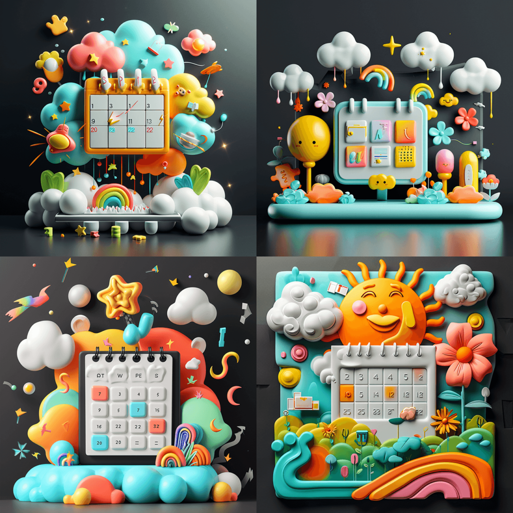
Illustration Style: 3D rendering
Colour scheme: Vibrant
Look and feel: Playful
Perspective: Isometric
Centrepiece: Rocket
Additional objects: Clouds, Plants, Bubbles
Format: –ar 3:2
/imagine a rocket as the centrepiece, launching from an island. Include some cheerful objects such as clouds, plants and bubbles in bright colours. –ar 3:2
Result based on the prompt:

However, as it turned out after using or passing on the prompt, it is very vulnerable. If you change the order of the words or leave out important, meaningful descriptions, you suddenly find yourself in a completely different spectrum. And how do you actually know which words are particularly meaningful?
I think everyone just starts off and enters different terms the first time they use them. Many are quickly disappointed and don’t even try any further. And at this point it becomes clear again how significant every single word can be.
When I passed my prompt on to my colleagues for testing, there were quickly many complaints, but also some very good results. Many graphics were diligently created, but many of them did not match the rest of the image series. The tricky thing about Midjourney is that all the results look super impressive at first. However, the user’s task is still to remain critical and make sure that the look really fits.
If you then receive a predefined prompt from the brand team, you might think that this will bring reliable results to the surface. But caution is advised.
In order to prompt an image that is consistent with the rest of the look, I need a lot of time and many iterations on the prompt. This means that when colleagues confidently choose the first image generated, it can quickly lead to chaos in the visual language. My task was therefore to build a more reliable system and document my prompts better for my colleagues.
Based on all this knowledge, I was able to create a visual description for our brand. This should also help my colleagues visually to better understand what look we are aiming for in the brand and which terms could have which effects. Nevertheless, as the “human in the loop”, I will inevitably continue to regularly check that the quality of the prompt and the selected images remain consistent and that the corresponding guidelines are clearly formulated so that our colleagues can also work successfully with the prompt. So, like a software product, a prompt is never really finished.

However, my learning here goes in two directions: I think you still need a trained eye to be able to recognize the differences and details. On the other hand, the language problem also caught my eye.
Talk like a Designer
So I took a closer look at my colleagues’ prompts and I noticed that they use many words better to control Midjourney due to their design background. It would be a shame if designers didn’t have any advantages when using them. In other words, a good vocabulary helps a lot. For example, if you can describe patterns, styles, perspectives, etc. precisely in terms of style, you have a home advantage and have to do fewer rounds with Midjourney. This helps, but is of course not enough.
Lesson learned: Writing a prompt once and hoping that a whole team of designers and non-designers will then generate the same look in images is a disappointment here. Every prompt must be continuously sharpened and adapted. Anyone who works in the software sector knows the game – nothing is ever finished forever. Even worse: it even breaks over time and therefore needs to be maintained, e.g. due to software updates.
Speaking of updates:
If there is a major update to Midjourney, and this tool suddenly develops a better understanding, for example, the little word “joyful” – which previously produced great results like creative abstract objects in the image – can suddenly turn into a childish look, with faces appearing on all sorts of objects in all my results. So unfortunately “joyful” had to be removed from our prompt. However, this little word had had such a strong influence on the previous look that I first had to work on the prompt for many hours in order to find my way back to the desired look with the new understanding of Midjourney.
So I took a step back and dived deep into the problem and the wording. I started a few tests and checked the individual words in my prompt. The result: If I enter “Joyful”, everything suddenly has a face after the new update. So I tested other words. Once I had entered “playful”, I was back on the right track. Of course, Midjourney ignored the command to avoid faces, which is fine if that’s what Midjourney says I want with the term “joyful”.

What I noticed during these tests, however, is that Midjourney is not always able to interpret peripheral phenomena. For example, if you want to go in the direction of “Brutalism Graphic Design”, you unfortunately only end up with architectural images. This means that you can prompt a lot, but you should also check how Midjourney interprets the terms and whether it knows them. If you have very crazy ideas of your own, you will quickly hit a dead end here, as Midjourney naturally tends to reproduce what it has already seen or what is tangible. If you enter “Artificial Intelligence”, for example, you get very abstract results. Which is understandable, as there is no tangible visual example.
This means that when we work with the new AI tools that are based on language, we also have to work on our language as designers. Working with Midjourney, I realized how difficult it is for me to find the right words to describe a very concrete idea, as there are few use cases for it in everyday life. I therefore believe that a new skill for future designers will be to master a large vocabulary in order to be able to describe visual ideas very precisely.
We should perhaps also take a look at the vocabulary of an entire film set. Whether it’s set design, lighting, lenses, perspectives and camera settings, make-up – everything is required when describing images. Vocabulary from graphic design, 3D modeling, art history, architecture, materials science and the broad field of illustration and art can also be helpful.
All these words should then be formulated systematically and according to a good logic. The clearer and more concretely we can describe our ideas and present them in language that is easy to understand, the better our starting point will be for investing more time in sharpening the variants. However, you should still plan time afterwards to fine-tune the images in photo editing tools.
Based on the current status (which can of course change quickly), I don’t believe that Midjourney can replace designers. For me, it’s a tool like Adobe or Figma and, above all, replaces stock footage. In the past, I would have had to spend hours digging through Shutterstock and the like to bring all the images together in thankless detail. Midjourney is an absolute game changer here. Similar to how ChatGPT supports me with texts, Midjourney provides me with the right images with the right look and feel. Nevertheless, the AI tools continue to cause rework, which still saves a huge amount of time compared to before.
Involving Midjourney in the brand development has enabled us to create a visual language in the brand that exceeds all expectations within the available resources. Two years ago, we would have achieved significantly different results. Nevertheless, the designers’ input and craftsmanship are still required to bring these results together to form an overall picture and ensure quality.
We have already dealt with the topic of language in this article, but the topic of “language” cannot function without the topic of “exchange” and should therefore be at least as important to us:
Our two locations in Frankfurt and Saarbrücken are currently a fantastic tailwind when it comes to innovation and future viability. In Saarbrücken, for example, we have many great research institutions on the university campus, such as the German Research Institute for Artificial Intelligence, with which we are in contact in our research projects. In the future, our Frankfurt office can only benefit from the attention that Frankfurt will receive as World Design Capital 2026 and we are already looking forward to many interesting contacts in this context.
Even if “home office first” means that the physical location is perhaps becoming less important again, it can be nice to have the right environment on site and be able to engage in more dialog, especially in innovative times like these.
That is why we are happy to offer dialog here too: Anyone interested in our approach to consistency in prompt engineering with Midjourey is welcome to contact us. Email to contact@centigrade.de
If you would like to see the quality of our images for yourself, you can of course also download our magazine “Macrocosm”.
We have aroused your interest? Take a look at our services!
