

Black text on a white background is trustworthy. Even more so: black on white is a fact. It is printed and displayed on screen. The truth is said to be “black on white”. Except when it is not. In programming, the truth oftentimes is white on black. And the truth was white on a blackboard back in school. There are reasons for these exceptions and there are reasons for the rule. I’ve collected some of the reasons that might be interesting for interface designers.

Let me start with a clarification: this is an article on black and white with black-and-white conclusions. I will stick to these topics and exclude variations of text/background contrast and text colors although they also strongly influence readability. In this text, “black on white” includes any form of dark text on light background, and “white on black” means any light text on dark background. White-on-black code, one exception to the dominance of black-on-white text, was an exception made because of technology limitations: some old cathode ray tube (CRT) monitors did not reach pixel refresh rates at 60 Hertz, the threshold above which we see a flicker-free image. Pixels on these CRT monitors flickered visibly and caused eye strain over time. The solution was to illuminate as few pixels as possible, as black pixels were untouched by the cathode ray and did not flicker.

For the technically minded: this is an original DEC VT220 connected to a machine running ELinks, which has loaded m.twitter.com. David Glover, CC BY-NC-SA 2.0
This is why command line interfaces used white text on black backgrounds – if the interface is all text, the eye strain reduction is valuable, especially after hours of work. White-on-black text became associated with programming, leading to the cliché of hackers in darkened rooms and the visual of the green-on-black matrix. This is a case of technical limitations influencing interface design and becoming a cultural convention.
As for the school blackboard, I have no good idea. Erasable writing materials are sensible for writing practice. Chalk (which as a matter of fact is white) and slate (which as a matter of fact is black) were common and relatively cheap. But other historic erasables like sand, clay or wax tablets did not use the white-on-black scheme. For quick notes, cheapness and availability probably overruled other factors.
Black on white – History
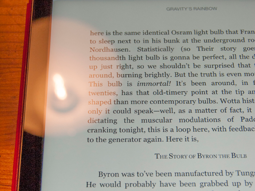
Books, of course, are universally printed in black ink on white paper. Paper evolved as the cheaper alternative to parchment, which was also white. Other historic writing surfaces like birch bark and papyrus are also white.

Print on paper: paperback edition of Catch-22

Manuscript on parchment: “Treatises On Natural Science, Philosophy, And Mathematic”, England ca. 1300

Manuscript on birch bark: the Rupavatra, a grammatical textbook based on the Sanskrit grammar of Panini, Kashmir, 1663, Wellcome Library, London, CC BY 4.0

Hieroglyphs on papyrus, Radek Szuban, CC BY-NC 2.0
It is black signs on white background, from first human graphic activity: the oldest known cave paintings in Europe were painted with black and red colors on white limestone – 40.800 years ago, in the Stone Age Cave of El Castillo in the north of Spain. In fact, nearly all cave paintings were painted with red, brown or black pigments on light surfaces. This may have geologic reasons: limestone mountains have an unusual number of caves, which became Stone Age homes and ritual places. When cavemen wanted to mark the white cave walls, the suitable pigments had to be dark. This is where I lost the historical trail – with many examples that show black-on-white text being the norm, but without an explanation. “We’ve always done it this way” is a bad argument, but 40.800 years are close to “always” when it comes to cultural history. Black signs on white background are a pretty established convention to lean on.

Interior of the Cave of El Castillo
That is what Xerox did in 1973, when the company started to look beyond printing. They founded PARC, the Palo Alto Research Center, and designed Alto, the first computer using a desktop metaphor. Today it is still known as the inspiration for Windows and Mac OS but back then it was a revolution. Xerox aimed to create a more accessible computer and started from a printer perspective: the Alto had a monitor with the dimensions of a US letter sheet of paper, portrait orientation, and a resolution of 72 pixels per inch (sounds familiar?) to resemble the 72 typographical points that make up an inch. Consequently, Bravo, the Alto’s text editor, displayed black text on white background to preview the printed page. It became the first WYSIWYG text editor and probably the first interface to bring paper’s black-on-white tradition to the screen. Xerox’s switch became the norm for word processing. It also shows how convention influences interface design – recognizable, existing patterns make for accessible interfaces.

The Bravo text editor on the Xerox Alto’s portrait-orientation screen.
Black on white – Perception
Let’s devote a paragraph to the misconception that white-on-black text is harder to read because bright letters melt into each other. The observation is right: legibility suffers. But the conclusion is wrong, because the opposite scheme, black-on-white text, has the same problem: the light background shines brighter than the text, spilling over the black letterforms. The cause of the lowered readability is not light bloom but a bad choice of fonts: thin fonts on bright white background are hard to read, bold fonts on black background as well. In both cases, designers have to increase the amount of black to balance the brightness of the white portions. Using delicate font weights for white-on-black text and robust font weights for black-on-white text improves readability.
 Black on white, the Baskerville’s thin lines are eaten away by the surrounding whitespace and white counters. They stay whole in white on black.
  The curvy Cooper Black is at home in black on white. Inverted to white on black, the bold letterforms squash their counters and the space between letters. In this case, it should be typeset with more than standard leading.
Astigmatism is a common defect of the human eye. About a third of the population is affected. Astigmatism occurs when the eye’s lens cannot focus all incoming light into one point anymore. Shapes are blurred, which is especially obvious on text. However, in bright environments the pupil contracts, reducing the focus aberration and the blur. Black text on white background creates a brighter reading environment, making the text sharper and more legible for astigmatic readers.
High light sensitivity, photophobia, is another common imperfection affecting around ten percent of the population. The higher a person’s light sensitivity is, the quicker white background will tire and eventually discomfort them. The black-on-white scheme helping astigmatic readers becomes problematic to light sensitive people over time, while the white-on-black text preventing eye fatigue for light sensitive readers is blurrier to astigmatic persons. Giving the user the possibility to use their own preferences is a way to overcome this dilemma. Even in this case, typography has to take into account the human perception and its imperfections.
Black on white – Context
The eye adapts to the environment’s brightness – after entering a house from a sunny street, or being blinded by headlights in the night. This process called adaptation needs some time and effort, both increasing with age. Repeated adaptation, for example while reading a bright screen in dark surroundings or a dark screen in bright sunshine, diminishes contrast perception. Conversely, text brightness that matches the environment reduces the adaption effort.
The bright text layout is readable through the lamp’s reflection.

The dark text layout is illegible in the reflection.
Black background is preferable in dark environments like cockpits at night, darkened rooms or while reading in bed. Conversely, white background is better for bright offices and the outdoor daytime. This scheme is also more legible through reflections from lights or the sun. Reflections quickly make white-on-black text illegible on black screens and glossy print.
Optimized for well-lit reading: bright, but not perfect white paper. Lighter than the background, but not overwhelmingly bright.
Readers are accustomed to texts that are slightly brighter than their surroundings. The lighter content holds their attention, while adaptation effort stays low. In interfaces, essential texts can be highlighted by black-on-white typography, with the white background area subtly showing readers its importance. Contrarily, secondary text like menus in white on black blends into the background while other content shines. Context is probably the strongest of all these factors that influence interface design – if the environment is known, text color is just one of many interface elements that might be optimized.

We used a black-on-white color scheme for the XING Windows 8 App. It is used in well-lit offices, hotels, trains and planes.

For the OMICRON CMControl interface, we chose white-on-black text. This power supply diagnostics device must be legible in dark transformer and relay stations.
Conclusion
The truth is “black on white” – for content, for bright environments, for crisp reading. The truth is “white on black” – for menus, for dark environments, for light-sensitive readers. With some websites, e-book readers and navigation devices, the users can choose which scheme they prefer. But in addition to that, the designer’s choice depends on technology, culture, perception and context. Designers need to keep all of them in mind. They move between these overlapping fields, making knowledge in all of them necessary. But their job is not to become experts, but to be aware of the factors and still create coherent symbols, typography, layouts and interfaces. Admittedly, this is easier written than done.
If you should be interested in getting help with your design tasks, you can find out more about how we can support you on our Design services page.
Windows is a trademark or registered trademark of Microsoft Corporation in the US and/or other countries. Mac OS is a trademark or registered trademark of Apple Inc. in the US and/or other countries. Xerox and Alto are trademarks or registered trademarks of Xerox Corporation in the US and/or other countries. XING is a trademark or registered trademark of XING AG in the US and/or other countries. OMICRON and CMControl are trademarks or registered trademarks of OMICRON electronics GmbH in the US and/or other countries.
