

Microsoft’s Modern UI design language has arrived in many applications with varying success. By now, almost everybody has seen Modern UI (formerly known as Metro), and Microsoft seems committed. Developers of Windows software have to think about the fact that a lot of established interfaces look out of place in a Modern UI environment. It needs to be adapted to the current state of interface design, even more with Apple similarly moving iOS 7 to a flat UI style. Working on such updates, we have collected a set of 10 design principles we call, for the sake of simplicity, “Desktop Modern UI”, and we want to share them with you. The first problem: the whole concept of windows, icons, menus and pointer looks out of place in the Modern UI environment. Modern UI means touch and gesture input, one task at a time, touch-first content, communication, consumption and leisure—rather than sit-down professional work. How can the next versions of professional desktop software relying on WIMP fit in here? Is there room for compromises?

One obvious example of a compromise is Office 2013, offering only one major difference compared to the 2010 version: a Modern UI look-and-feel. Due to the fact that the interaction design changed little, Office 2013 makes Modern UI for desktop look like a re-skin of existing software—but it’s not that easy. Microsoft changed the interaction design of Office 2007 and 2010 to make it more accessible, and the Modern UI style of Office 2013 is just the visual design catching up. Seen next to each other, the last three versions show that there’s no instant Modern UI ignoring that computers changed in the last ten years. Windows 8 and Windows Store Apps are a different adaptation to this change, which certainly represents Modern UI for the desktop. But in the future there will be powerful, information-rich software that is best suited to monitor, keyboard and pointer, and there will be Modern UI that suits it, as exemplified by Office 2013. This particular dialect of the Modern UI design language is what we, for the sake of simplicity, will refer to as Desktop Modern UI. However, it lacks an readily available official design guideline. Our 10 design principles are a first step to fill that gap. They are basic and independent of operating system, programming language or application.
Square 1
 Let’s start with basic shapes. Apple has made the rounded rectangle its own from the mythical days of the original Macintosh. With Modern UI, Microsoft claimed the square. Square pixels are our building blocks, and the rectangular computer screen is our canvas. A square is the right symbol for an “authentically digital” style, and squares and rectangles will be the foundation of our application layouts. As nearly all screen layouts can be expressed as stacked and nested rectangles, this sounds pretty obvious. But every application of Modern UI also avoids organic curves and rounded corners right down to the details of icons. In our Desktop Modern UI designs, we at Centigrade use simple, geometric icons from our PlainSeries and MonoSeriesstock icons to enhance the Modern UI look.
2. Whitespace
 Now that we have set the canvas and had a look at our building blocks, let’s start to make a mock-up from the wireframe using Desktop Modern UI. A useful first step is to translate the wireframe boxes into groups using whitespace instead of borders. Artemy Lebedev summed it up nicely in 2006: “objects lying close to one another are perceived in a coherent way”. Every word, icon and graph has to go somewhere eventually, so make the positioning count. Herd the elements into invisible squares. The more obvious our groups, the fewer background textures, drop shadows, colors and fewer separator lines we have to use. This gives us a good start towards the minimal, clean look of Modern UI. When we structure our screen with whitespace between groups of elements, we can also indicate hierarchy: more whitespace around an element denotes its higher rank and makes it more prominent. You’ll always notice Google’s search field, placed on its own in the center of the screen, but you may miss the elements snuggling up to the top and bottom of the screen. Word 2013 places whitespace around the document page to show its importance. Headlines are framed by it. Whitespace around something important also distances it from visual distractions. Take a page from a hardcover book—why did countless book designers ever since the Renaissance leave so much of it blank, if not as a visual quiet zone?
3. Negative and Positive
 Our layout is using whitespace to make important areas obvious. We also need to differentiate between editable areas and buttons/menus. To Craig Gannell, the limited palette of Desktop Modern UI design elements makes that demand difficult to meet, while commentator Nathan Pitman points out that the problem is not the Desktop Modern UI style, but a bad implementation of it. We like a positive/negative divide to strongly separate menu from content. We’re used to black-on-white content, especially if it is text, so it’s easy to build upon this convention. Text-based content will create a light, mostly monochrome area. To set off the menus, we use white text and icons on solid, dark color. If possible, we’ll use a hue associated with the software product or the company behind it. Microsoft has steadily associated the Office centerpieces Word, Excel and PowerPoint with blue, green and red, for example. This color distribution also marks the areas of influence: the menu is created by the software’s maker, so it carries their colors. The content is created by the users; it’s their realm, so it uses a different color.
4. When to be a Little Dense

 Excel 2013 and Word 2013 both put content front and center and give it as much space as possible. By comparison, the menus are crammed to the top of the screen. Priority is clear: content first. The spacing also contributes to the overall look of the two areas: content is large and clean, menus are small and packed. They’re easy to tell apart. Again there’s whitespace and grouping at work, this time one level down from screen areas: between lines of text, buttons and icons. The clean backgrounds of Desktop Modern UI give us precise control over the contrast and darkness of the group as a whole. We can use a typographic concept called type color. It describes the darkness of a block of text—to judge it, step back until lines blend together into a block and observe the shade of grey.
  Technically, it’s the ink-to-whitespace ratio. Practically, it also depends on the smoothness of the distribution of black shapes on white background. It’s influenced by font face, spacing, line height, font size, ink color and background. And we can use type color in our interfaces: spread-out icons with grey labels result in an airy, light menu, while a block of text with little line height and a light yellow background looks darker. Take a few steps back and the two areas are visually separated at first glance.
5. Grid
 At that point everything’s in place, united in groups and separated by whitespace, marked by contrast and density. Now, let’s use a grid to give all our screens a common rhythm. We want a little freedom, while keeping to a baseline grid. In our case, the basic text uses 22 pixels line height. Dividing this 22 pixel space places a grid line every eleven pixels. That enables elegant half-line paragraph margins and uneven line heights of 33 pixels or 55 pixels for larger text. Now, the eye can move down the screen at regular steps, picking up the rhythm after gaps of whitespace. Let’s also repeat the 11 pixel-steps as horizontal distances when we can. But—we don’t need to force a grid on the content. The length of text, for example, is harder to change than the line height. The grid should not imprison it. In their practical handbook about design grids (“Praxishandbuch Gestaltungsraster”) Regina and Andreas Maxbauer call the grid a jungle gym, not a cage. Play with it. Are we wasting space by using a grid? Comparing straight redesigns holding exactly the same content, Desktop Modern UI style needs a bit more space. But that space is not wasted. It’s silently structuring the screen. It’s not always the end of the world if users need to scroll: it’s becoming easy, even delightful to swipe and flick on aluminum touchpads and glass screens. And if the content does not fit, go back to the wireframe: does your user need everything on that screen at the same time? Can they handle all the input?
6. Animation
 Another tool to bring our screens together: Desktop Modern UI uses subtle animations to add Feel to its Look. In Office 2013, the cursor glides from one letter to the next while typing them, numbers flip into a table cell, the file screen slides in from the left while its arrow icon turns in sync. If something important happens on screen, it does so with a little movement to call for our attention. These animations also add substance—it looks like there’s deliberate machinery behind the bare layout, moving the parts around. Many animations are transitions; they hint at connections and help us build a mental model of the interface.
7. Cut!
 A lot of desktop software is information-heavy by necessity. That often means lots of small objects on screen, but there are other options that don’t screw up order, legibility and target size. Extend the screen, scroll, paginate! However, we need to show the scrolling affordance and position on multiple panes, palettes or windows. Avoiding drop shadows and strong borders, Desktop Modern UI elegantly cuts off content mid-item wherever it’s possible. This shows there’s more to come, an invitation to scroll or page. Windows Phone even crops off titles in its horizontal-scrolling panoramas. Out of sheer curiosity we want to complete the fragment, and our pattern recognition guesses the overlap, because lines, icons, letterforms are interrupted by a common edge. This way, we show layering without extra chrome. Overlap also helps with the positioning and layering of pop-ups. Encourage pop-ups over content, so their edges become more obvious.
8. Saturation
 Our brains don’t only interpret a drop shadow as a signal for visual depth, other cues can help to show the layering of content as well. Looking at a mountain range on the horizon, peaks nearer to us will be more colorful, while peaks at the back will fade and seem grey: dust particles floating in the air refract the light, washing out the colors over distance. We’ve internalized this effect, so without thinking we know that low saturation indicates distance. So keep the top layer colorful while dimming the lower layers, and your pop-up jumps to the front.
9. Monochrome and Color Icons
 Icons in Desktop Modern UI come in two styles: monochrome pictograms, featuring prominently in the Windows 8/Windows Phone start screen tiles, and colorful but flat icons, as used in the Office 2013 ribbons. The two distinct styles, used in one screen, complement each other. The monochrome icons are used for the familiar functions that are consistent across applications: an “x” to close, a “magnifier” for search, a “+” for new item and so on. Users have learned these metaphors, I’d venture that the pictograms are read like words, and I want to use them like words: inline, sized and colored like text, without separating borders or lines. In web design, such icons are even delivered as fonts.
 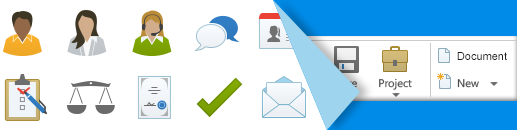 The colored icons, on the other hand, call attention to the software’s unique functions. Closer to small illustrations, they can effectively explain new features. Like illustrations, we place them out of line, on white background, adding a label if necessary.
10. Typography, again
 The tools in our lightened Desktop Modern UI kit are more effective than in chrome-heavy layouts. Text, for example, is not competing with background, glow, gloss and drop shadows. The right choice of typeface, boldly sized and colored, sets a mood for your mock-ups. Desktop Modern UI also makes text carry extra information with capitalization: all caps for menu items (Office 2013), all lowercase for headings (Windows Phone). Text capitalization is usually combined with font size: all-caps are scaled down to blend in with mixed-case text. All-lowercase headlines use larger sizes in Desktop Modern UI than in other interface styles. The combination clearly distinguishes. Your font of choice’s magnified letterforms get a chance to shine, especially since Desktop Modern UIs generally use a high contrast. There are concerns about the legibility of single-case text, but it seems to boil down to habit. We’re just used to reading mixed case. In this case, our users are not reading a whole book: for single words the difference is negligible. Let’s keep all content comfortably mixed—and use the exceptions in the menus and structure. So, we’ve got a way to add differentiation to text regardless of color, position, brightness, background or content.
Conclusion
Professional desktop software tends to show a lot of information at the same time. Creating Desktop Modern UIs, we have to plan for lots of content. My inspiration here are the works of Edward Tufte. He collected and analyzed elegant displays of dense information that are effortless to read. Let’s aim for a high information-per-design-element ratio in our Desktop Modern UI design, likewise. If everything works, the screen is more than the sum of its parts. Tufte also coined the term “chart-junk”: useless elements in diagrams that lower the information-to-ink ratio. We should be wary of UI junk.  Drop everything that doesn’t contribute, clean out the noise, ornament and distractions, take out the junk! Graphic designers have been doing that successfully for eighty years. By applying the same principles to interface design with unprecedented consequence, Desktop Modern UI is adding value beyond an up-to-date look. All trademarks or registered trademarks are properties of their respective owners.
