In April I blogged about metro style pictograms being the new sliced bread in icon design. Remember? The article was, of course, highly interesting, incredibly important and not to mention terribly knowledgeable – and naturally it was in no respect longwinded. Well. Let’s just say it was rather formal and academic. Today, dear reader, I am going to be emotional. And pretty much so. Why? Because bad user interface design can drive you up the wall.
For me, one of the main reasons for becoming a user interface designer always was my incomprehension towards hardly usable everyday objects and especially user interfaces. Not only as in computers, machines and technological devices per se, but also as in – well, as in practically anything. I kept on optimizing things in front of my mind’s eye. You will probably agree with me, that everything having at some point been invented and then designed for being used by human beings might pose as a “user” interface in the widest sense of the word. Somebody had an idea, made the idea come to life and developed it into the respective hard- and software products we use or look at today – all the while making various decisions about functionality, appearance, usability, you name it. Products such as coffee makers, email-clients, the new iPad or a pencil sharpener. But the thing is, half the time nearly no product creator seemed to have given the slightest thought to usability at all.
Let me give you some examples of what I mean – the following things all happened to me, although I will take the artistic liberty of being creative about both time and place to spice up your read.
Monday morning
Why can we fly to the moon in spectacular rockets but can’t pack our food in functional wrappers?
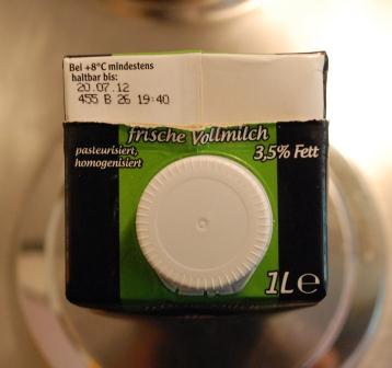
Founded in 1951 and revolutionizing the bottling of beverages Tetra Pak sells about 4.9 billion packaging containers a year in Germany. And looking around our supermarkets they seem to quite hold the monopole here. This really is fine by me. I like the thought of my vitamins and minerals being preserved in the dark of these non-see-through, allegedly recyclable and very efficiently stackable containers. What I really don’t like is not being able to open the silly thing using the mechanism provided by the producer – the lid.
Let me introduce to you the milk carton I have been buying on and off for the last few years:

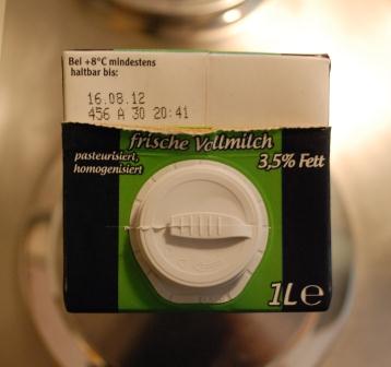
The visual design has changed a few times, sadly enough not always for the best – in principle a visual makeover will only do the trick if you think about usability every step of the way – but the packaging itself stayed the same until a new lid was introduced. A wider opening is really very sensible because it gives the air a chance to stream in compensating for the liquid flowing out and by that refraining the beverage from splashing and spilling. Well done! Other milk suppliers have taken this up as well:

The thing is, with the product I buy regularly you don’t get to enjoy the wider opening. Not well done indeed. The sequence of events goes something like this:

“O look, I only have to pull at this strap to open up the container.”

“O dear, I ripped it off! Now what? Maybe I can push it in, since there are other Tetra Pak containers where this is possible….. Turns out I can’t. Then I will have to cut it open….”

“!*%&!!”
Still Monday morning
Why run a few use cases when we have people replacing the machine?
Trying not to cry over spilt milk I cleaned the latter of the kitchen counter, drank my coffee black and started on my journey to the train station. On arrival I went to the ticket machine to buy a ticket. While I was looking at the new user interface of the ticket machine, I remembered the time I tried to use the old one. And made the grave mistake of choosing the express-buy option. Only having literally 30 seconds left to catch my train I had to navigate my way through an information-gathering process that was actually longer than the one not designed to speed things up. And guess what, instead of printing my ticket immediately the machine was good enough to print two or three slips of advertisement, a travel itinerary and two receipts beforehand.
You guessed right, I did not need either of these things and no – of course I never made that train. Instead I got myself another cup of coffee – with milk this time – and enjoyed watching the train operators’ “guide-to-buy-a-train-ticket”. The at that point new interface of the ticket machine had just been introduced, which had one most prominent effect: the rail operator had to employ one person per machine to guide the customer through the buying process. Anyone else see the flaw in that plan? Ok, I am being vicious. They actually did see it themselves, and now, another generation of ticket machine interfaces later, you can actually buy a ticket pretty quickly and efficiently. Although they are still using the ABC keyboard instead of introducing the QWERTY one which due to its widespread use most of us are pretty familiar with (this being my humble opinion in the question of “QWERTY vs. ABC or maybe rather Dvorak?”, but let’s not also indulge in that one today). O well, one can’t have everything.
Monday around noon
Old generations, new generations and the circle of life
Back when I got advertisements printed instead of a ticket, I actually had no one to blame for being late in the first place than myself. But the ticket machine did not exactly make life any easier. Today I was late because of a product designer’s averseness to usability testing and hey, the ticket machine saved my neck this time round – I made the train. Although this does seem to restore balance to the universe, peace of mind still always seems to boil down to usability in everyday interfaces. This is what I talked about with my colleague on the train ride to the client we were visiting. More precisely we compared usability bloopers on our respective mobile phones. O and incidentally, my colleague was late, too.
 His being late was a direct result of his smartphone – his alarm did not work. While my old Motorola mobile with its hardware buttons, low resolution and terrible ringtones always managed to come back to life to sound my mornings’ alarm even when it had switched itself off due to an empty battery, the new generation smartphones don’t do you the same courtesy. And that although, let’s face it, their battery-cycles are much, much shorter. But you do have to admit to them that they all, whether old or new, put up a fight when their energy level gets critical before actually powering down as though they want to waste the little energy they have left on purpose. My old Motorola unnervingly and persistently beeped itself silly until I got up from the couch and connected the charger. Well, if you have to go, you might as well go with a bang, ay?
Peeping itself silly is something my old washing machine used to do, too, although in its case it was no question of life and death, but only of conveying a piece of awareness information – that my washing was ready to be stuck in the dryer. Can you believe it? The machine actually forced me to get up and switch it off for no good reason at all. O, and by the way, what happens when the machine finishes and I am not home to praise it for its good job? Then it will probably drive my neighbors round the bend, because the thing literally does not stop beeping. Ever.
But let’s get back to smartphones, and more precisely to my colleagues and mine shared smartphone usability blooper favorite: not being able to access the core functionality of the device – the phone. Our winner in this category was the Android HTC Desire HD:
Imagine yourself sitting on the bus listening to an audiobook on your phone. Because you are a considerate person you have switched your mobile to vibrate as not to disturb the other passengers in case of an incoming call. (Also you would like to save yourself from repeating the experience of the ringtone being blown into your earphones full-volume…) Half an hour later you find out that you actually had 6 calls in the meantime, because someone really desperately needed to talk to you – and you had promised to keep the phone on your person throughout whole day. You may ask yourself how this is possible. I did, too, and so did my colleague. The mobile just vibrated away happily in my pocket, while the playback of the audiobook was not interrupted (which it is when the phone is on full volume). I mean, really, the phone rang out, while I was directly connected to the device via my headphones. Anyone see the flaw in that concept, maybe? I mean, really!
Monday afternoon
At least the presentation is going well. Probably because we were smart enough not to do a Prezi.
Monday late afternoon
Grouping, people, grouping!
Another train ride filled with stories about memorable usability catastrophes later, some of them prominent enough to fill a whole article by themselves, I was back at my local train station. Because I had spilt my milk in the morning, consequently missed my bus to the train station and then rushed through town by car to meet the train, I now had to go to the park & ride to collect my car before going home.
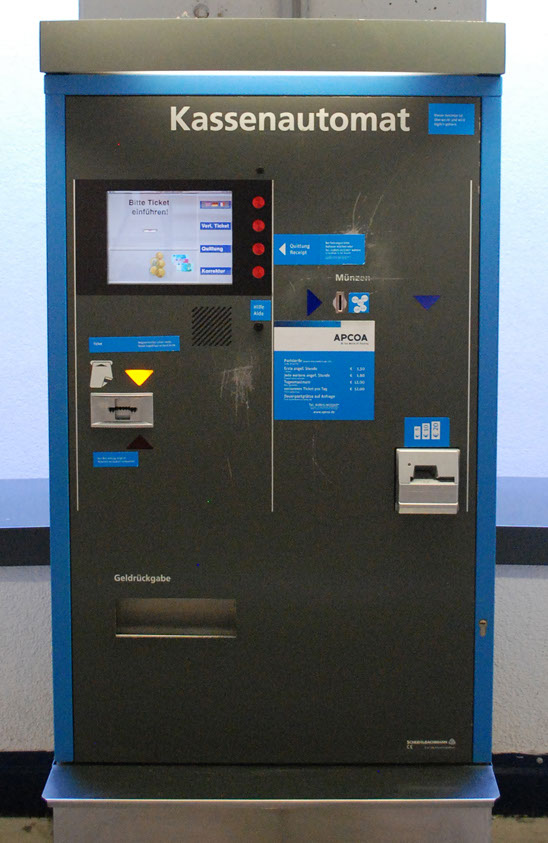
Watching people paying their parking tickets at the parking machine can be quite as entertaining as watching the rail operators guides guiding customers through buying a train ticket. Sadly enough, I reckon this thought never crossed the mind of the person who designed the parking machines interface. The process should not be that difficult: you put your ticket in a slot, wait until the display tells you how much money to throw into the next slot, which you do, and then you get your ticket back. So much for the theory. Admittedly, practice is a little more complicated. You have to account for the fact that people, me included, nowadays want to be able to pay by any possible means known to mankind. That means slots for putting in coins, notes, credit cards and maybe even debit cards. This does complicate matters. But this is actually where user interface design should step in, isn’t it? Well, it most certainly did not when this machine was designed, and this is actually not even one of the worst ones:

At least here they tried to visually separate the two sub-processes of sticking in your ticket and looking at the display from actually paying. Do you see the grouping? The thin white line in the middle?

Not really sufficient? Thank God there are four flashing arrows (e.g. one in yellow below the display) to point you in the right direction:

(I wonder what the one below the ticket slot might be for?). Just that the two blue arrows (on the left) will flash in turn to indicate where to pay, trying to communicate that there are different means of paying:

And there was me thinking you were actually supposed to guide the user’s attention step by step instead of actively confusing them….
Of course the users will only arrive at this point if they have first figured out not only where to put in the parking ticket, but also which way around. There are four ways to choose from, and I have not yet seen a pictogram that actually leaves you without a doubt on that point (for enlightenment again see the blog on pictograms).
Monday evening
The circle closes
Okay, only one more left. You might be wondering what on earth I might have kept on to until the grand finale. Well, the circle did close that day, we are back to packing materials.
When I finally came home and walked up my garden path, I ran into my neighbor cursing at the top of his voice. Well, I did not literally run into him, since I could hear him from a mile off – and in his defense, he normally is the most good humored and polite person on the face of this earth. But life did play him a trick that evening, or rather non-usability of everyday objects did:

As a picture says more than a thousand words, I probably won’t have to explain the situation or how it came to be. But bear with me one more time: what you are seeing is the organic garbage of my very health-conscious neighbor. And as an additionally also very environmentally conscious person he buys recyclable paper bags to take his organic left-overs to the respective trashcan in the back of the driveway. Problem is, the bottom tends to give way. No need explaining either that this is not supposed to happen, or why it’s not. But as Jonas very wittily pointed out (his last month’s blog on user interface architectures was also very enjoyable and illuminating!), the producer of this recyclable paper bag probably expects you to put a throw-away aluminum bowl on the floor of the bag, before you dump in your decomposable organic waste.
Conclusion
Ok, this was really fun. Because although I could really have done without any of those incidents on any single day of the year, they do remind me of the reasons for taking up this line of work in the first place, and that I am dead right where I am.
On the other hand one should always remember that bad user interface design makes the users feel bad about themselves, too, since at first instance, they will perceive their not getting along better as a personal failure.
In the last few months everybody seems to have started talking about user experience and how crucial it is in purchase decisions and therefore marketing strategy. In my humble estimation, and I say this being a big fan of enjoyable interfaces, we might want to take a step back and tend to usability first, before we think about how we can make the customer rejoice with pleasure. Because, dear readers, usability can make the world a better place. Don’t believe me? Scroll back up and look at the pictures once more.
All trademarks and product names used on this website are the properties of their respective owners and are used solely for descriptive purposes.
Tetra Pak is a trademark or registered trademark of Tetra Laval Holding & Finance S.A. in Switzerland and/or other countries.
Android is a trademark or registered trademark of Google Inc. in the US and/or other countries.
HTC Desire HD is a trademark or registered trademark of HTC Corporation in Taiwan and/or other countries.
Prezi is a trademark or registered trademark of Prezi Inc. in the US and/or other countries.


