

If we are honest, we all are desperately awaiting the future. We are waiting for the next boom, which seems so close but actually didn’t come much closer for the last 5 years. Microsoft’s Fluent Design is one of these developments that promise a brighter future. Will it be able to live up to the high expectations of the UI Designer communities? What can designers, what can developers take from it right now? I took a look at the Fluent Design System and explored it during my work on a first test project. In this article, I’ll share what I learned so far.
A disappointing start for Designers
For me the trailer of Microsoft’s Fluent Design was huge. A short video with glimpses of the entire Microsoft world and how it all comes together through this new design approach, supported by a very powerful music. By the way, did you see how in one trailer an email was entered into a form and the system responded with “improperly formatted email address”? Someone at Microsoft has a dark sense of humor.

How can the Design System be put to use? Redesigning one of our internal apps, it was my first approach to a Fluent Design hands-on project. As a first attempt, I thought I would actually read through the style guide. I made it halfway before giving up. The official documentation is, in my opinion, rather aimed at developers than designers, which is great for the coding part. But visuals are rare – the main share of the design segments is represented by code and their implementation. This way, developers are able to easily gain access to the core features of Fluent Design. For the designers, unfortunately, there is only an incomplete toolkit for some prototyping software available for download. Neither the style guide nor the software really outlines any aspects of the design in detail, so it is necessary to reach out to further medium articles and fluent design prototypes to get the whole picture. As the toolkit is in constant development itself, it probably will catch up to the official documentation soon. But for now, the starting experience for me as a designer was mediocre, to say the least.
But back to my plans of building an app. While working on this project I came to notice a few things: The layout redesign creates less friction than the metro design system did back in the days. The horizontal navigation with the redesigned ribbon, once “the controversial tabbed toolbar implementation that made its debut in 2007” (neowin.net) and now evolved to be a delightfully simplified navigational area was one of the first changes to an effortless experience in Microsoft Office software.


Ribbon in MetroDesign vs ribbon in Fluent Design (Courtesy to howtogeek.com and winfuture.de)
More eye-catching though is the playfulness of light and depth in the new fluent design examples, which actually manages to come across as natural and not gimmickry.
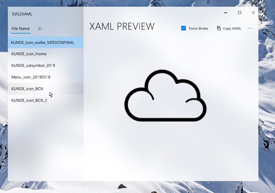
While working with the design style, this thoughtfulness regarding the representation of physics rubbed off on me. One of the core features of the app I was working on was to convert SVGs to XAML. For the aspects implemented into the design I considered whether its behavior comes across as natural as possible. I admit it sometimes didn’t work out as smoothly as it sounds here. For the background I used exclusively acrylic to give the software a lightness.
The navigation is also kept as minimal and organized as possible, thanks to the extremely structured vertical layout. I faked the reveal highlight in the prototype as it plays a main part in handling the cursor. I wish I could have implemented this feature of Fluent Design as well as the native animation in a more defined way into the prototyping software. But here it shows again that the documentation apparently is more tailored to the needs of developers. For the designers, it is not yet possible to recreate many aspects in the prototyping software. If this would be possible, I think, we could take the design style to a whole new level.
In a nutshell, the style characteristics like the acrylic part, the natural animations and the use of light build the bridge between skeuomorphic design and flat design. In this way it transforms the emotions associated with the UI into a futuristic, still native sensation. The advance of acrylic transforms the flat surface of the screen into its three-dimensional universe, with depth and a sensation of physics while the approach of light on the other hand seems to be giving superpower to the human touch. Why does it work so well? I am currently reading “Microinteraction” by Dan Saffer, and I have a feeling, someone at Microsoft Design Team did too. For example, as Saffer teaches in his book, Fluent Design uses the preexisting interface to add a new dimension with the connection of light and cursor. By looking at details like this, Fluent Design reinvigorates the overlooked things, like for example the cursor’s prominence. In my opinion, this is why these visual effects come across as natural, and not superimposed like a Hollywood blockbuster.
In comparison to the universe of possibilities, Microsoft itself makes use of Fluent Design in a cautious, even shy way. The Office 365 software is slightly redesigned, and the usability increased, yes. But all in all, the acrylic and the vertical layout look a lot like a slightly different version of macOS, and some people, who are not paying close attention, probably didn’t even recognize the change.


Acrylic Backgrounds and the vertical layout can also be found in macOS.
The potential is there to enhance a UI with the characteristics and to go even further, to make the software on a laptop as exciting as on a VR headset. In my opinion it is now on us to take the idea and start our own interpretation of the design style. Let’s make it huge by taking the interpretation of light further, of behavioral adaptions and after all by taking up the core idea implemented into the design style.
Supporting Accessibility
My favorite aspect about fluent design, though, is not visible on first sight. Once more, Microsoft is reminding the developers and designers that inclusivity is important. In a way it is a shame that we still need to be reminded, but here we are. Microsoft is not only giving us a hand by offering free end-to-end support from educational work to tests, they want to change accessibility and inclusivity to be something amazing. For example, their 4 principles of accessibility are far away from screenreading support or large font sizes. “Think universal”, “Make it personal”, “Keep it simple” and my all-time favorite “Create delight”. Two of those principles can be found on their own in many products. “Keep it simple”, one of many variations of “Keep it simple stupid”, has been imprinted into every designer’s and manager’s brain and is also one of the core aspects of Fluent Design. “Make it personal” has been the reason why we have to create an account and to remember all the passwords for nearly every single app on our phone. However, it is also the reason our apps remember our preferences in regards of brightness, colors, font sizes and favorite content to give us the best experience. Additionally, Microsoft is using “Think universal” and “Create delight”. The combination of all four principles forms the basis for an inclusive and accessible experience. “Create delight: Delightful experiences evoke wonder and discovery. Sometimes it’s magical. Sometimes it’s a detail that’s just right. We design these moments to feel like a welcomed change in tempo. The result is an experience that has momentum and flow.” It is difficult to combine the principles, and without doubt it takes time to include it into the daily habit of designing. As the app is a prototype, I tried to use high-contrast colors within the app. For further implementation of accessibility, I am looking forward to pushing this along for the final designs and the development of the actual product.
Bottom line
Fluent Design has some very strong notions which could take UI and UX design one step further. It is right now still putting out feelers and therefore missing the opportunity to make the impact it could, especially by mostly aiming at developers and leaving designers hanging in the air. But there is inspiration and for us designers, it might be our responsibility to carry this inspiration to the next level. But it is definitely our responsibility to finally implement inclusivity into our design process.
