In the first part of this series I described how user interface design tools bring together developers and designers in a seamless workflow and gave an overview of the technical environments of Adobe’s and Microsoft’s tools in that area.
In this article, I am going to focus on the use of pixel and vector graphics in design, deal with some of the pros and cons of the two graphic types and finally give an introduction on the scaling of bitmap GUI components.
Pixels Versus Vectors
One major difference between Expression Blend and Flex Builder is their preference in supporting pixel and vector graphics. While Microsoft’s tool almost completely focuses on vector graphics, Adobe’s product supports both types to the same extent. Both tools, Expression Blend and Flex Builder, are mainly targeting the RIA sector.
Vectors are attractive…
Vector-based graphics, as favored by Microsoft, seem to be the clear winner in that context because they are smaller sized and consume less bandwidth than pixel based graphics, which makes them the better choice to build interactive and responsive user interfaces for the web.
Besides efficient performance in the RIA sector, Microsoft has a particular good reason to set on vectors: the interactive multi-touch table Microsoft Surface enables users to move, stretch, collapse and rotate graphical objects directly by using gestures. These sophisticated real-time transformations are only possible with the support of vectors. Furthermore, vector-based graphics are easier to handle and manipulate on the programmatic side of the GUI. Changing the rounded corners of a vector rectangle, e.g., is a simple task for a developer as it simply consists of changing one value. If pixel graphics are used, it is necessary for the designer to redo and replace one or more complete graphic files to attain the same effect.
…but raster graphic still matters
So why bother to support those old-fashioned, inflexible and memory wasting pixels as done in Flex? – Because they still are the better solution for complex and delicate graphic effects. The rendering of such effects on a vector base is still not fast enough on many machines. Although Microsoft’s graphical framework WPF is able to support graphics acceleration via the Windows-bound API DirectX, which improves the performance of graphic rendering tremendously, the Silverlight version of the WPF which is a subset of the original WPF and meant for the use in web, is limited here due to its platform independence.
This very real need for relying on pixel-based graphics can be observed when we create an icon with MS Expression Design, Microsoft’s graphic design tool, which, as stated above, focuses on the creation of vector graphics. Effects like drop shadow, bevel and emboss or Gaussian blur are theoretically realizable with vectors, but it would go at the expense of performance. Therefore, after the icon is saved in the XAML format, upon taking a closer look at the containing folder, we discover a sub-folder that contains all the pixel graphics needed to realize the beautiful graphic effects. So, even though it seems at first sight that Microsoft clearly goes for vectors, even for them it is not yet the time to banish pixel graphics completely.
Scaling Bitmap Graphics
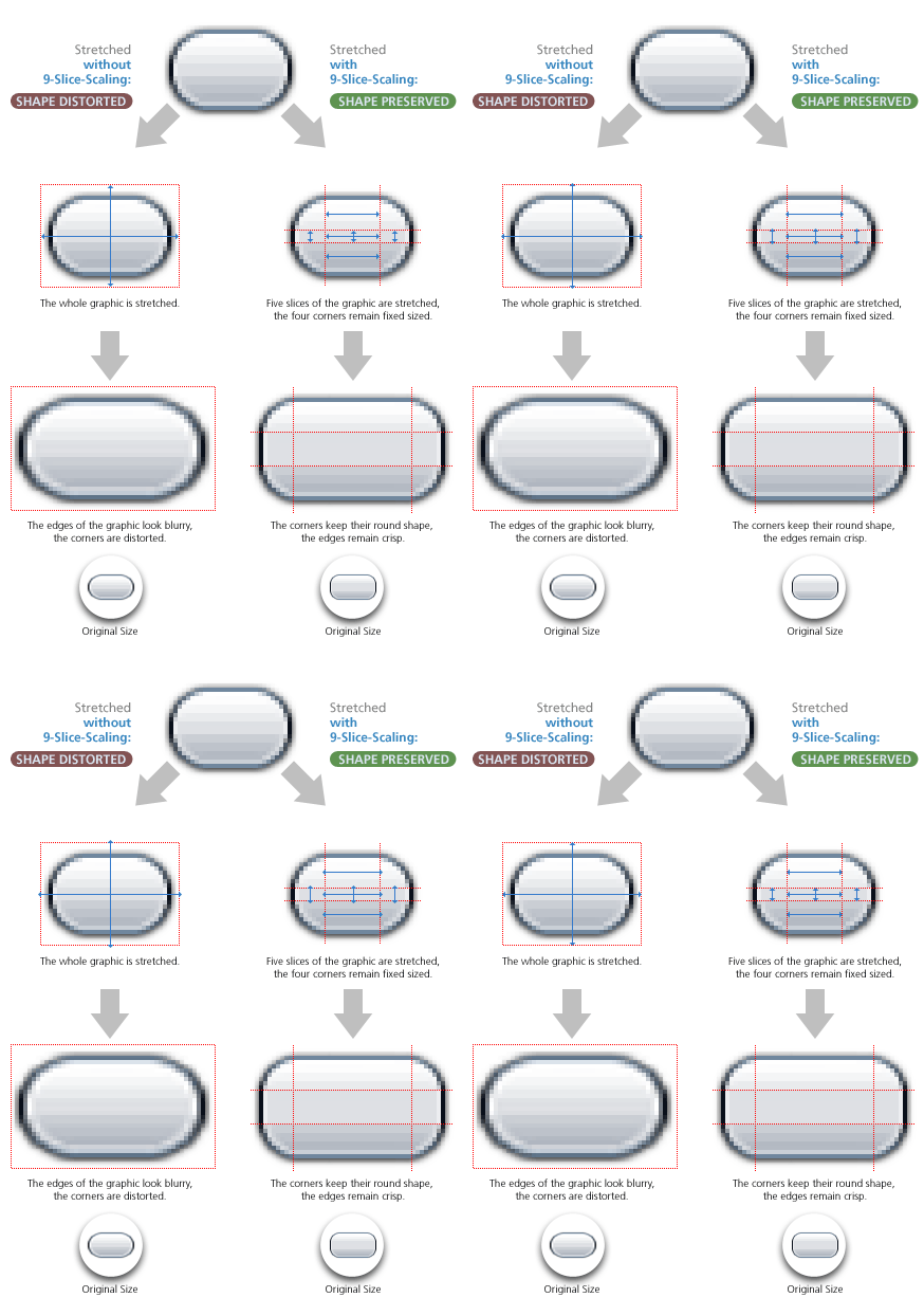
In addition to the performance problem with effects for vector graphics described above, a quality problem is faced when scaling down those graphics: vector objects that are scaled down to a small size, e.g. icons, mostly lose their quality and end up as an unidentifiable pixel chunk. (For more information on this topic feel free to read our articles about resolution independent icon design.) Choosing pixel-based graphics is part of the solution to that problem. They, too, cannot simply be resized at will, because blurry or distorted graphics will most likely be the consequence, but when only certain graphical components – as opposed to the whole graphic – are resized, the desired high-quality results can be obtained. This is done in the following way:
9-Slice-Scaling
Most components have a rectangular shape or can be assembled from such shapes. Each of those rectangles can be divided into nine pixel graphic slices, which behave differently when the component is resized. The four corners contain fixed graphics. These are the only areas that are not resized when stretching or collapsing the GUI component. The four edges – top, left, right and bottom – are the areas whose content is only stretched or repeated in one direction while resizing the component. The left and right edges stretch or repeat vertically, top and bottom edges horizontally. Finally, the center graphic has to respond to both, vertical and horizontal resizing.

Similar approaches
This method, which Adobe calls 9-Slice-Scaling, is applied nearly everywhere in the user interface development sector, e.g., by the Ajax web application framework ZK, the mobile operating system Google Android (called 9 Patch Images here), Java Swing and last but not least by our own Java Swing Look and Feel Engine Cezanne. 9-slice scaling will even become a standard for Websites as this approach has already been introduced in the upcoming CSS 3.0 release. In this context it is referred to as the border-image.
In the final article of this series, I will take a look on how good Expression Blend and Flex Builder handle pixel based GUI components and draw a final conclusion after comparing both tools.
All trademarks and product names used on this website are the properties of their respective owners and are used solely for descriptive purposes.


