

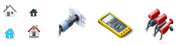
Icon design is my day-to-day business, ranging from universally applicable Home icons to very special icons for the wiring of electric relays in substations. Recently I learned that interpreters also use symbols to be able to “sketch” the meaning of spoken words quickly and recall them later. I used this occasion to take a step back and look at other helpful uses for symbols.
Common and Special Icons
Pictographic Language
Symbols and icons are well suited for depicting both simple, physically existing objects as well as complex or abstract concepts (for a more detailed definition of symbols, icons and pictograms I recommend the blog article “Pictograms – The New Sliced Bread in Icon Design” by my colleague Jenny Gemmell). In user interface design, this is very helpful when using navigation objects (arrows, folders, symbols for different areas of an application) as well as abstract objects within the application (projects, documents, contacts) or whole functions and actions (open, export, save).
UI Design Icons from our PlainSeries Stock Icons

When an icon depicts the respective object as a precise visual representation, i.e. when it is an icon in its original meaning (cf. Jenny Gemmell’s article), it can be used globally without any explaining label. There are also well-known icons in user interfaces, which are always used for the same objects and functions; users therefore do not need to re-learn their meanings over and over again.
Those icons do not necessarily need to be self-explanatory as the example of the floppy disk icon for saving data shows us. The metaphor of a floppy disk, which originally had an iconic meaning, as people really saved their data on floppy disks, has remained unchanged for quite a while and certainly could be replaced by a more self-explanatory depiction. A UI icon with the symbolic meaning of “save” or “store” would be suitable, as due to technical progress, the kind of storage medium certainly will evolve.
A possible Evolution of Save Icons

But in some cases sticking to well-known concepts has the advantage that a “collective memory” is established and people do not need to re-think and re-learn constantly. Thus, in case of the floppy disk icon, its meaning has changed from an iconic one, the actual depiction of the storage medium, to a symbolic one, which stands for the “idea” of saving data.
Symbols as a way to visualize information compactly are used in many fields, e.g. signage for public areas or road traffic. In these cases a large part of the world population has to rely on the meaning of the symbols, which should be clear and easy to understand.
Sketchnotes
Beside those simple symbols which usually contain only one single piece of information and can easily be learned and comprehended, pictographic language is becoming more and more important for complex information constructs—e.g. meetings and oral presentations—to reproduce the content later in an illustrative way. Visual note taking is nothing new for creative professionals. In the last few years “Sketchnotes” have been enjoying increasing popularity. This technique aims at summing up a whole speech by combining some kind of mind maps to one coherent and easy-to-understand scribble.
Sketchnotes are, however, a type of information visualization that not only uses symbols but also other, more detailed elements. It also cannot capture a speech word for word, as it aims for a more schematic illustration of speech content. Last but not least, considerable drawing skills are required to create a Sketchnote.
Interpreting Notes
Interpreters have to comprehend and reproduce complex information within a short period of time and do not necessarily possess the drawing skills required for Sketchnotes. Still they use the benefits of pictographic language to meet their demands.
An interpreter friend of mine recently told me about interpreting notes used for consecutive interpretion. When in consecutive mode, interpreters note down the spoken words over a certain period of time—in contrast to the simultaneous mode—and afterwards translate and proclaim them. It is therefore essential to note information very quickly and in a compact way and to reproduce the information almost lossless. Instead of writing down the spoken word by word, e.g. with the help of stenography technique, interpreters have a different way of recording information in a compact fashion: abbreviations and… symbols!
Examples of Interpreting Note Symbols
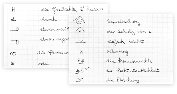
Besides some established, commonly used symbols, interpreters make up additional symbols in order to avoid any uncertainties while writing down information and to understand and reconstruct its meaning later. That means that those symbols have to be target group oriented—only that in this case, the target group consists of only one single person, instead of many people as in user interface design.
It is therefore not important to use only well-designed icons that are easy to understand for a large number of observers. Instead, functional aspects become important: short words are simply written down as they are, sometimes even the initial letter of a word is enough and longer words are encoded as symbols that can quickly be sketched. While taking the notes, the symbols are combined in such a way that even complex relations can be reconstructed later on.
There are, however, some symbols, which are generally comprehensible, e.g. the linked rings, which stand for “partnership”, the little roof to illustrate the meaning of “protection” or the abstract microscope, which stands for “science”.
Icons everywhere!
I think it is encouraging and inspiring at the same time that symbols (or icons) find practical use beyond user interface design. Of course they still are able to act as design elements and influence the appearance of a whole graphical user interface. This especially plays a major part when dealing with the currently modern Flat Design (or Desktop Modern UI), where by leaving out meaningless decoration, fewer and fewer degrees of freedom remain for actual design of the interface. This means that icons have an even more important role here, because the eye of the beholder is drawn to the few graphical elements that are left.
When working with icons every day though, one sometimes loses sight of the benefits that exist beyond aesthetics. Those examples of other areas show us the main purpose of an icon: the ability to communicate meanings quickly and depict even complex concepts in an easy-to-understand way while occupying very little space. It certainly is advisable to keep in mind this practical potential every time, when developing another new fancy icon style.
All trademarks and product names used on this website are the properties of their respective owners and are used solely for descriptive purposes.
