

Where and why do analog and digital materials differ fundamentally? And what does our Armadillo Outdoor Office desk have to do with it? Analog and digital material in human-centered design processes.
Role models and roots
Many of us know the great design role models such as Dieter Rahms, Charles Eames, Richard Stark or Jony Ive. What do all of these popular designers have in common? They can all handle physical material.

Source: https://br.atsit.in/de/wp-content/uploads/2022/05/jony-ive-ist-gastredakteur-der-sonderausgabe-der-zeitschrift-how-to-spend-it-der-financial-times.jpg, https://64.media.tumblr.com/15b5c999c44c98b9a9f5ac6df82ae809/cc37bed9315818c6-61/s500x750/4183add9cbb74074948bac83c344f7f7579f9355.jpg
If Jonathan Ive had gone straight into digital design, he certainly wouldn’t have received the fame he now enjoys. It was his legendary iMac design that got him heard. And some of you may also know that Jony Ive certainly found some inspiration or other from Dieter Rams. So Jony Ive was not a software designer per se, but first of all an industrial designer or product designer.
Jonathan Ive’s father was a silversmith who worked at a college. Every Christmas, he gave his son a day in his workshop to build exactly what he wanted – so materials science – working with physical artifacts – was something Jony Ive was practically born with.
Differences and similarities between analog and digtal
Somehow it seems obvious, not least because of this history, to look for a common ground between digital design and classic product design. After all, our successful German design tradition, for example with the Bauhaus, is definitely a point of contact for inspiring young people for the craft of design. Considering digital as a material also inspires and opens the door to this tradition without closing the door to the future.

Source: Quelle: https://www.hfg-ulm.de/med/310-hfg-geschichte-1.jpg
But the continuation of this success story can only succeed if it is also clear what digital material is in the first place and if this metaphor also becomes more tangible for an outsider. Above all, the metaphor must be tangible, for young people who, for example, are enthusiastic about the job description of the digital design professional, the DDP. Here, the metaphor of digital material is already being used consistently.
I therefore want to show differences and similarities between analog and digital material and inspire to see the separation between hardware and software less strongly, but to understand design as a holistic process that in the end serves only one thing: a better user experience for the respective end users of the digital product.
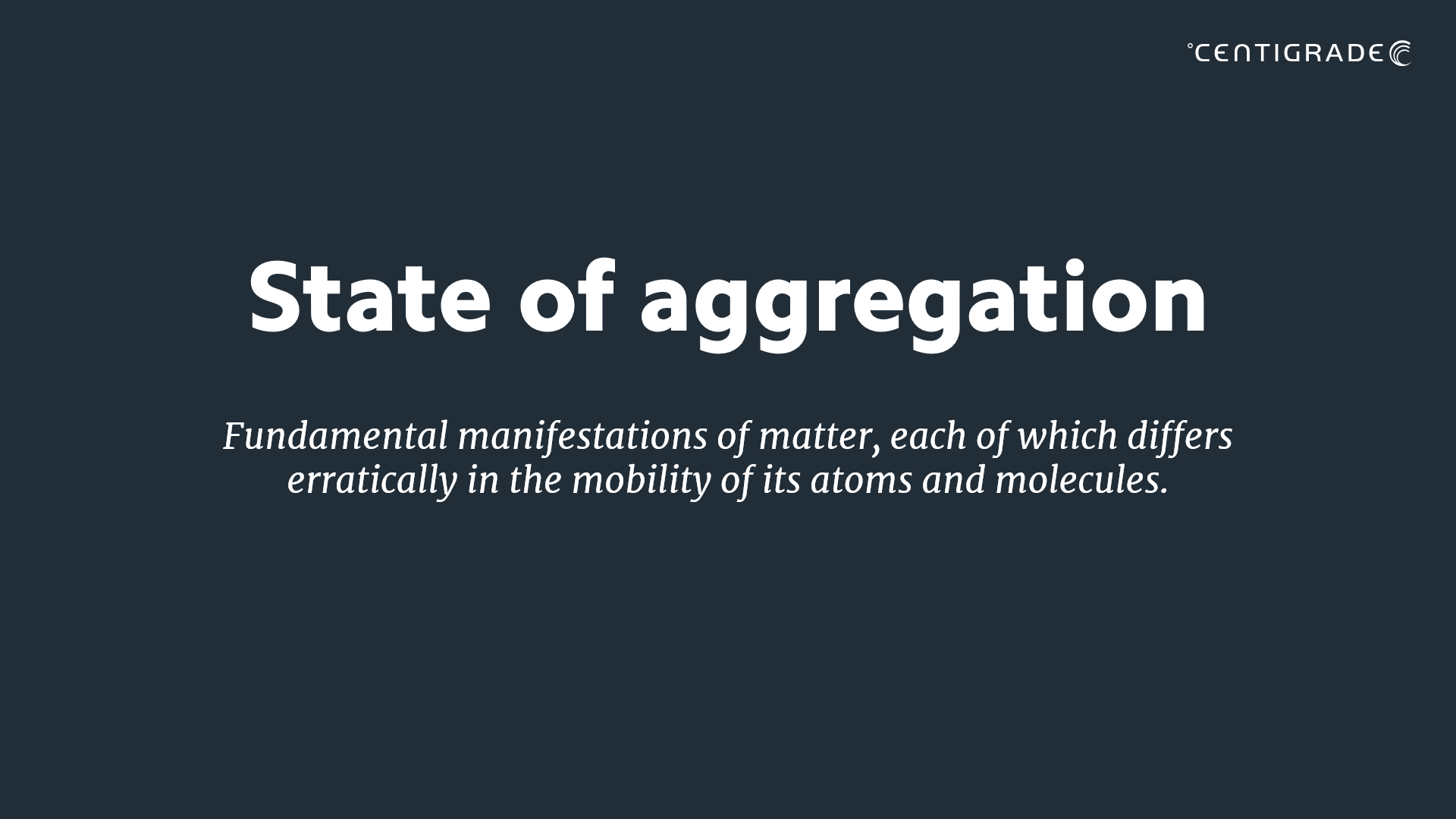
But what is (digital) material anyway?
Well, everyone certainly has their own definition of it in their head, but in terms of construction, it is a material in a solid state of aggregation. Materials are therefore physically stable, go into a product, are therefore consumed and thus have to be procured anew.
In this original sense, the analogy is already a bit misleading, because of course it is different with digital products. Digital material would be software components, UI elements or APIs in the figurative sense. We don’t have an aggregate state here at all – but of course everyone still wants to install only stable components. And if we talk about “consumption” at all here, then it’s usually about memory consumption or something similar.
But actually, digital products have no real limitation in terms of their reproducibility: an app installed on millions of smartphones was nevertheless only written once and then only copied again and again. Of course, the app consumes some of the main memory of each individual user – but only during use. Digital material is not consumed during production! That’s the great thing about software and that’s why software eats the world! “Software eats the world
But what is the greatest advantage of software is sometimes also its greatest weakness. Software is virtual, abstract, partly invisible and difficult to understand – let alone “grasp”. This is exactly why user interface design has become so popular and we ourselves have been earning our money with user experience consulting and user interface design projects for over 17 years – so I know what I’m talking about.
People want to be able to see, feel and experience a digital product. And ultimately, that’s what designers are here for – whether they’re digital designers or classic product designers.
And here we already have the greatest common ground when it comes to the analogy between analog and digital material: the product should please people and deliver a perceived added value. Personally, I love the material of my MacBook because it feels good to put the heel of my hand on the keyboard, I hate drinking sparkling water from plastic bottles or cups because I think I can taste it. By the way, I lost the blindfold proof 😉 But it doesn’t do me any good, because I still believe it. User experience is simply irrational.
UI vs UX Design
But my examples just now were physical experiences again and UX is a software discipline after all! Well, not really. The user experience makes no difference between hardware or software. On the contrary, the more the boundaries between these two worlds blur, the more holistically a product can be experienced, the better. Breaking points are the enemy of good UX.
And user experience is obviously not at all easy to explain, as such analogy images on Linkedin brutally demonstrate time and again.
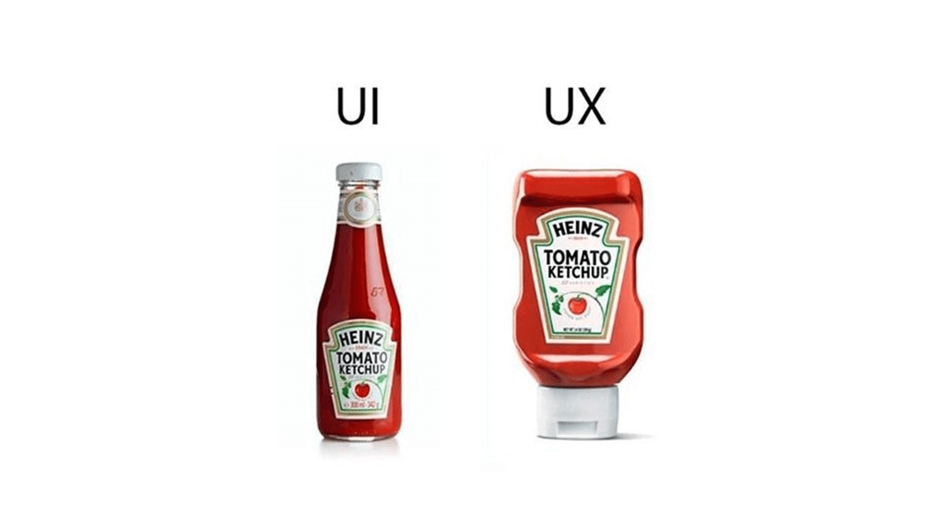
The fact that physical ketchup bottles have to be used as objects of comparison in order to explain the difference between the UI and UX terms that come from digitization speaks volumes. If this comparison is then also spectacularly wrong and is nevertheless wildly clicked and liked, then this only shows: software people also crave simplifications and analogies to known, materially physical!
Those of you who are now interested in what is so wrong with this picture, please feel free to read and comment on my post on Linkedin about it – I posted it about 2 weeks ago and am still working through the many comments below it anyway 😉
But, if you want to get into the ketchup bottle comparison now, at least you can straighten out the picture by writing “UI” over both bottle designs and putting two other “UX” images underneath each that are representative of the respective user experience.

Source: https://www.patrickhansen.com/wp-content/uploads/2017/09/UI-vs-UX-ketchup_2017_02.jpg
So far, so good. But from the point of view of our material metaphor, we haven’t made much progress yet. UX and UI design are crafts of the digital age and, at least in their external presentation, are already more user-centric than traditional product design ever was. But obviously we still need analog examples to be able to explain these crafts at all and then also incorrectly – keyword glass vs. plastic bottle.
Let’s take the image apart and make the analogy that we could be dealing with two software UIs in the case of the two ketchup bottles. The design of the left glass bottle clearly scores with the question: how around does it actually belong?

Source: https://www.facebook.com/interactiondesign.org/photos/well-in-heinz-sight-design/10161286023517228/
The plastic bottle, on the other hand, clearly scores in the accurate dosing of the ketchup. Here, too, opinions (or Linkedin users) are already divided. Some comments have said that the farting sounds of the plastic bottle towards the end of its life cycle are “unworthy”.
What happened here from a material point of view? Well, strictly speaking, the ketchup is not a material at all, since it does not have a solid aggregate state. In the software world, it would be “merely” content.
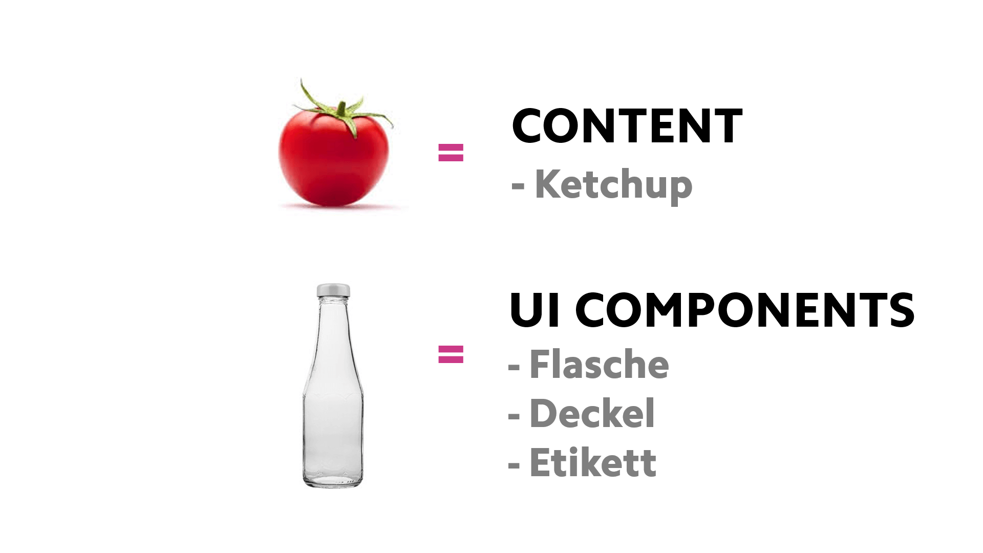
“Only” content? Material or not – of course the content has a significant influence on the interaction experience: little content generates more fart noises, a lot of content reduces the fart noises. And: the fact that HEINZ is on the label shows that it obviously does matter who the content provider is. Perhaps this also shows that the discipline of “UX Writing” is becoming more and more serious, because it doesn’t matter what you say on the UI, nor does it matter how you say it.
But let’s get back to the actual material topic, because of course the material used has a significant influence on the way a product is used. Anyone who has ever tried to squeeze ketchup out of a glass bottle has either failed abruptly or ended up in hospital with serious injuries.
The selection of the material thus quite obviously also influences the affordance, i.e. the appeal, of a product and thus also the behavior of the users.
But let’s get to the real core of the excitement in the duel glass vs. plastic bottle. According to the picture, the glass bottle is supposed to represent UI design and the plastic bottle UX design, because the glass bottle looks nice, but unlike the plastic bottle, it can trigger a gross operating error. If the user does not shake the glass bottle beforehand, he will not receive any content at first and then – suddenly – suddenly receive much more content than he actually wanted.
Why is that? Well, if ketchup is left to stand still, its various components form individual molecular bonds, which in turn form compounds with each other. This creates a relatively stable structure, making the liquid more viscous and solid. The force exerted during shaking destroys this structure in the ketchup; the hold among the molecular bonds weakens, and the molecules can move more freely. As a result, the ketchup becomes liquid again. This is the thixotropy effect.
One might think that this is actually good for HEINZ, because more ketchup is consumed. Paradoxically, however, HEINZ seems to be oriented as follows when it comes to increasing consumption: because children can portion the ketchup themselves more easily with the plastic bottle, this leads to more ketchup consumption than a glass bottle that has to be learned can ever provoke.
Obviously, in the material discussion, the aggregate state of a product package or content is even more important for the interaction experience and user behavior than already assumed.
A designer must therefore be familiar with different aggregate states of materials – regardless of which domain he is working in – in order to be able to do a good job. Or let’s put it another way: a sculptor who creates sculptures out of ice will certainly be out of a job pretty quickly if he thinks he can be successful in a working environment with temperatures above 0° Celsius. He’d better retrain quickly.
The interaction behavior of a material or whether content is delivered in the correct dosage thus depends to a large extent on both sides on the respective aggregate states.

Source: https://pbs.twimg.com/media/FUt3mquXoAEldzn.jpg
Looking at digital material and digital content, you have to ask yourself the question: What is the aggregate state of digital material in a figurative sense? And how does it change through the interaction behavior of the users?
Digital material
Digital material, just like analog material, can be rather static and rigid. This can be an advantage for users in some situations, but perhaps a disadvantage in others. And, of course, a digital designer who wants to be human-centric needs to know about the aggregate state of digital material.
An example of a rigid and rather static material could be, for example, an already existing REST API. A REST API is a clear interface that is unchangeable in its current version, a kind of “contract” that designers and engineers can agree to without encountering nasty deformations in the course of their design process.

A REST API can be used very easily and out-of-the-box as a material with a solid aggregate state and therefore does not have to be pre-processed first, like a raw material, for example. It makes life easy for designers in that they can focus on the actual user need instead of the question: how do I make a material out of this raw material here?
But unfortunately, this is exactly the behavior I observe in my everyday work, especially among inexperienced UX designers. If the task is: “Design a login dialog for a specific user group”, then at a certain point designers should also ask themselves what digital material they would use to bring this login dialog to life. For example, they would have to ask themselves: which REST APIs on the topic of authentication currently already exist and which API function have been “in the oven” long enough so that they can be used like the fired brick as a stable design and construction tool. A brick was also originally once clay until it was fired. Of course, houses can also be built with clay, but the design of the house must then definitely become another.

Instead, one of the most common reactions I’ve seen from inexperienced UX designers is to create a few wireframes for a login dialog, which then remain underspecified in many places, much to the chagrin of frontend engineers. Why should a designer alone be able to produce more specification depth than a panel of API experts plus a horde of open source developers? Yet I often hear UX designers say, “I don’t need to know about APIs! That’s a software engineering topic.” Is this kind of digital material science asking for the impossible, or is this what digital design is all about?
Digital Designer as Product Designer
We turned the tables and imagined that we, as digital designers, had the same mindset towards analog material. What if we digital designers had to build a desk without knowing anything about the materials needed for it? To make it a bit more interesting, we didn’t want it to be a normal desk, but an outdoor office desk, i.e. a desk that is suitable for mobile screen work outdoors. We got the idea from the Corona situation at the time, which meant that we hardly ever saw each other in real life, but the urge was great to work together in one place without a mask.
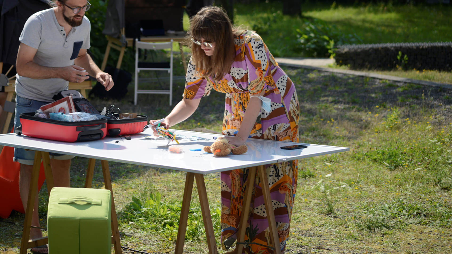
Due to the temporary nature of this outdoor workspace, there were already some constraints: of course, the desks had to be easily transportable and easy to assemble and disassemble. At the same time, they had to be stable and large enough to work comfortably for an entire workday. We also wanted the desks to be sustainable so that we didn’t leave too big a footprint.
How did we get started? After a short user research by interviewing our colleagues, we were able to find a good workstation size. In the idea phase, we came up with the crucial approach of how to keep the sunlight low enough to see enough even on conventional monitors. Instead of a sunshade, we had the idea of an accordion-like tent hood. This hood would allow us to keep out the sun’s rays from both the back and the front, but at the same time open it as wide as we wanted.
The idea and the desire were quickly expressed. But even during the prototyping of the hood, we digital design professionals lacked crucial skills. What kind of material do you actually use for such a hood so that it keeps UV rays out as much as possible? What kind of material do we have to use so that the leverage forces acting on the hood don’t cause everything to break apart at the slightest gust of wind? What kind of material do we use to build the desk so that it is light, strong, and yet sustainable and aesthetic?

We were digital design professionals and we didn’t know anything about analog. So we did the best we could in that situation – we brought in an analog designer, Fabian Revilla.
It was only with him in the team that it became possible to even begin to turn our rough wishful thinking into a tangible prototype. Why? Because he knew his way around materials. And he also had the tools to work with this material: he could sew, he could saw, mill, glue, screw and everything else that was needed to get to the goal. Fabian had a great sense of which materials would hold in which aggregate state under which conditions and when they would break. We learned from him: a table is only a table if you can sit on it without it collapsing under you. Because of the uneven ground in outdoor contexts, he angled and rounded the legs, and because of the leverage of the angle, he used a rougher material and larger knobs for the hood adjustment screws. Because of the fluttering noise the wind might make, he chose a fabric that had some thickness, even if it came at the expense of overall weight, because it also significantly reduced UV exposure at the same time. Because some parts of the desk could not be shaped with conventional tools, Fabian had to use a Shaper Origin as a hand-held CNC router.
Imagine if Fabian, as the lead designer, had simply provided us, as the commissioning stakeholders, with a scribble of the table and the hood and then said, “Here’s the design. All you have to do now is implement it. What kind of material you need for this idea, how much it weighs, how it’s connected, and how it reacts to sunlight, I’m afraid I can’t tell you that either.” With this attitude, a product that could be used in reality would never have been created.
Conclusion
The human-centric process is not that different depending on whether you are working with digital or analog. It’s about knowing user needs and resolving them across physical boundaries. It’s a fluid transition these days.
Therefore, just like an analog designer, a digital designer must know his or her materials and their aggregate states as well as the tools and their advantages and disadvantages in detail. A digital designer must also know the frameworks and tools on the basis of which software is created. Drawing and describing concepts is not enough to catch up with analog designers. The tools of the digital design professional therefore consist not only of drawing programs such as Miro, Figma and Sketch, but also of engineering tools such as GraphiQL, Git, VS Code or Strapi.
We have aroused your interest? Take a look at our services!
