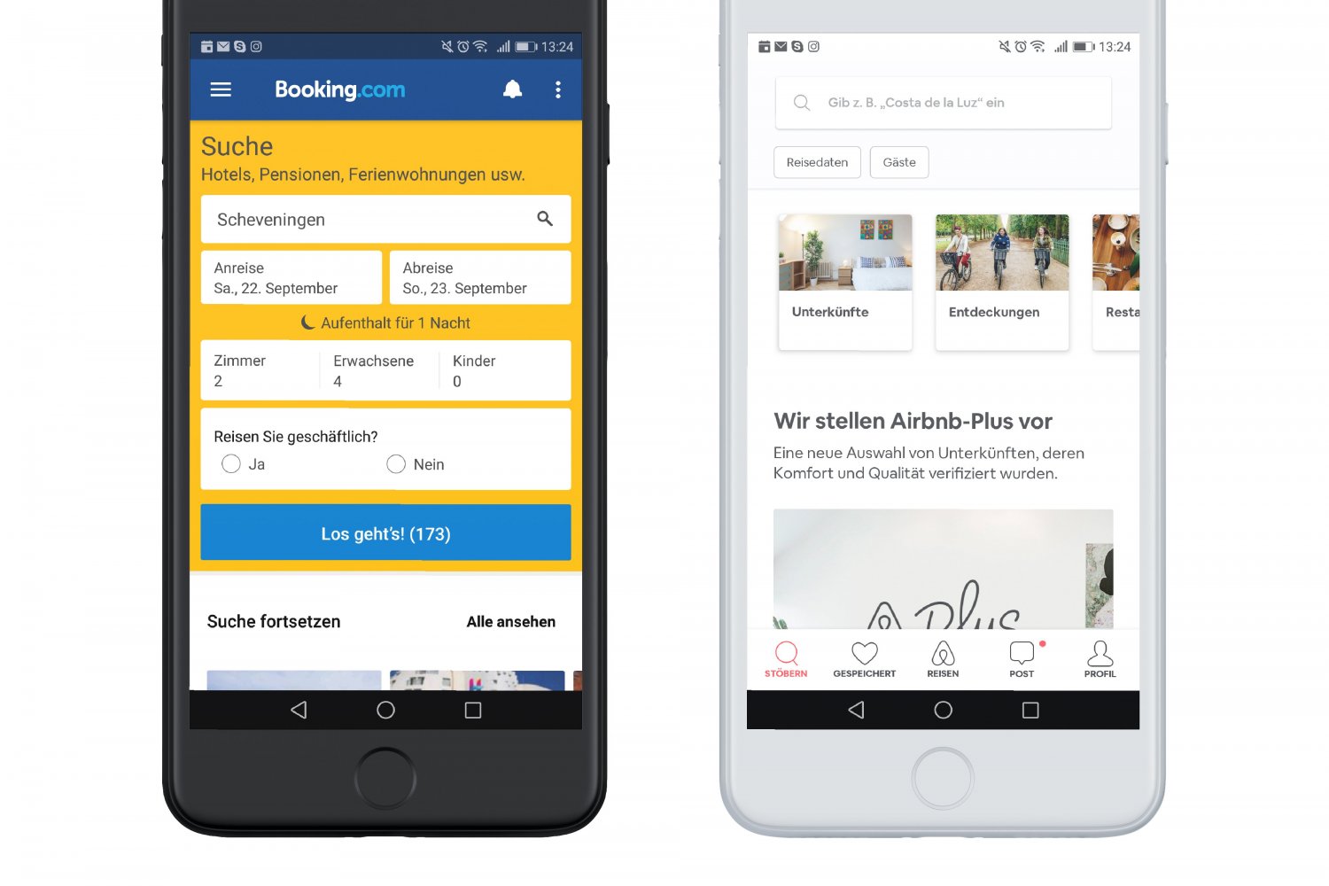
Blog

Multi-platform mobile software development: Qt instead of Xamarin

Jörg Preiß
February 28th, 2017

Microsoft is accessing the field of WPF platform independence with Xamarin Forms. However, there has for a long time been an existing framework that runs on Windows, MacOS, Linux and starting with version 5 on iOS, Android, Sailfish OS and other operating systems – without re-implementation: Qt.

#include „maincontroller.h“ 
#include  
#include  
#include  
#include  
#include  

int main(int argc, char *argv[]) 
{ 
    QApplication app(argc, argv); 

    QQmlApplicationEngine engine; 

    QQmlContext* context = engine.rootContext(); 

    QString currPath = QDir::currentPath(); 
    context->setContextProperty(„currentPath“, currPath); 

    QScreen *screen = QApplication::screens().at(0); 
    int width = screen->availableSize().width(); 
    context->setContextProperty(„availableWidth“, width); 
    int height = screen->availableSize().height(); 
    context->setContextProperty(„availableHeight“, height); 

    MainController* mainController = new MainController(); 
    context->setContextProperty(„mainController“, mainController); 

    engine.load(QUrl(QStringLiteral(„qrc:/main.qml“))); 
    return app.exec(); 
} 

LISTING 1: MAIN.CPP


Qt has been around since 1992. For a long time, the company Trolltech distributed the framework commercially. There was a free version for the Linux desktop KDE that later was licensed under GPL. The two versions differed in the availability of certain modules. Starting with version 4.5 in 2009, the LGPL (GNU Lesser General Public License) was added. The current version 5.x is available in commercial and free versions as well. The rights are currently owned by The Qt Company.

Qt development was distinguished by the signal/slot principle. While other frameworks still used events, this already was an implementation of the publish-subscribe pattern. A button provides the clicked() signal, which view components can bind to a slot onClicked().

Version 4.7 introduced the Qt Markup Language, QML. While designers previously generated the completed source code, now the interface could be described in a JSON-like language. On-screen elements can be manipulated with JavaScript, values and lists can be bound. The framework achieved an architecture called model-view-delegate. Version 5.6 was used for this article. read more…

Digitalization – serious monkey business

Clemens Lutsch

Imagine that you are chosen to handle digitalization for your company. Of course, you hear the talk of heads of politics and business ringing in your ear. You have quite possibly already visited trade shows loudly promising digital transformation and industry 4.0, but delivering very little on the matter. What’s the reason for this letdown? Is digitalization an empty word, a bubble filled with hot air? Is it just monkey business?

The monkey business of digitalization

What has gotten into the author? Google Trends clearly shows that digitalization is a hot topic!

„Digitalisierung“ in Google Trends (D) over the last five years. [Google is a trademark or registered trademark of Google Inc. in the US and/or other countries.]

read more…

Eight steps to create an app icon

Olga Poliakova
December 22nd, 2016

BeforeAfter

The Icon – it is a small element, yet it is the first thing that users see when meeting an application – and a first impression can last for a long time. So, it is very important for a product to have an attractive, clear and explanative icon. But how to reach that? I would like to share my knowledge in passing through these steps using pen and paper as well as Adobe Illustrator. I worked as an Icon Designer for many years, and I still create icons from time to time, so maybe you will find my experience useful and can use some of my tips for your work.

Just as an example, I will create an Icon for a hypothetical insurance oriented application “Weather Event”, which warns about dangerous weather conditions (such as storm or hurricane) and suggests to insure a property depending on a situation. I will take you through the necessary steps. So, let’s start! read more…

Establishing an HMI Styleguide in a Company – Part 2

Thomas Immich

The first part of this article was about the treacherous intuitiveness of establishing an HMI styleguide based on a Corporate Design (CD) styleguide, and why this decision is risky: unlike a CD styleguide an HMI styleguide has to work for software engineers as well as visual designers. Also, this form of documentation is too rigid for a dynamic modern HMI. The most important insight: an HMI styleguide cannot be the sole basis for developing a consistent, aesthetic and intuitive HMI. Looking back on many years of big HMI design projects and speaking as a UX consultant I can say: only a combination of tools and processes will lead to success.

TRUMPF-Centigrade-HMI-Styleguide

Figure 1: Centigrade is supporting TRUMPF to establish a company-wide HMI styleguide.

read more…

Establishing an HMI Styleguide in a Company – Part 1

Thomas Immich

Intuition seems to be one of those things we all profit from a lot. But at times it will deceive us. Designing an intuitive HMI seems to be one of the highest priorities of modern software development, minimizing both the need for training and the risk of operational errors. Still, a lot of software engineers and even HMI designers stumble into one trap when aiming for intuitive software design: listening to their own intuition. They will tell themselves, and quite rightly so, “A good HMI design has to be aesthetic and consistent, so that operators will be able to profit from already learnt patterns in a new context of use – if they can use one machine, they can use all machines.” So far, so good. But now comes the misconception: “If you want your HMI design to be consistent in every way, why not adapt the already established corporate design? It has been there for ages, guiding along the way to consistency and brand experience: the corporate design (CD) styleguide”.

Alas, this is the wrong analogy – but not the first time it has been used: the early years of television had the same problem, reading the daily news to their audience the same way radio did, or the early years of the internet, displaying long columns of information in serif fonts, just like contemporary newspapers did. This might have felt intuitive because it was well-known and long-established – but it was still wrong.

The philosophy of a CD styleguide cannot be transferred to a modern HMI and its development.

screenshot Amazon 1994 und AppleCom 1997 newspaper metaphor in the web

Even Amazon and Apple were wrong to assume it was a good idea to apply a newspapers’ design guidelines and know-how to the internet.

read more…

Getting to the root of the problem: Debugging TypeScript projects with Visual Studio Code

Thomas Becker
Thomas Becker
September 29th, 2016

Although being relatively new Visual Studio Code has already gathered much attention since its publication in November 2015. At first glance you could believe that Visual Studio Code was just another iteration inside the Visual Studio family, but that is not the case. Visual Studio Code is a completely new phenomenon and does not have much in common with its namesakes, except for its actual name.

There are many good reasons for using TypeScript in a new project instead of JavaScript. To name just one advantage TypeScript allows you to structure code in classes. In this post I would like to address how to debug a TypeScript project with Visual Studio Code.

read more…

OK Google, what about good UIs?

Olga Poliakova
August 31st, 2016

Not everyone likes Google products, but everyone who has a computer / laptop / smartphone uses them. It’s really fascinating how a company founded by two students conquered a huge part of the market, became the most desired employer, and every year continue to surprise us with highly innovating ideas. And it’s even more fascinating how a company with about 60.000 employees apparently can’t afford good user interfaces (UI).

Search results – bad Google UI

Google is a trademark or registered trademark of Google Inc. in the US and/or other countries.

read more…

Cultural Awareness – Start Becoming an International Designer

Chloe Chan
July 29th, 2016

I can still remember the moment when I was up in the sky looking down on Frankfurt, anxious yet excited. In June 2015, I moved from my hometown Hong Kong to a country known for its beer, sausages and miserably cold winter – Germany. It was indeed pretty intense for me as I had never travelled to Europe before. And when I did, I started living and working as a UX designer there.

Being International: More Than a Matter of Geography

After going through the culture shock, I realized that being a truly international designer is more than just a matter of geography. Travelling and living in another country won’t make you international if you are narrow-minded, reluctant to look further at the cultural influences behind those behavior and thoughts that you find it hard to identify with. read more…

Picasso didn’t need usability tests

Günter Pellner
Günter Pellner
June 30th, 2016

Please take the following with a grain of salt, a slice of lime and a big portion of good-natured humor: Below we dive into the fictional world of a very naïve designer. The situations are exaggerated on purpose to illustrate some of the difficulties designers can fall prey to when they do not have an overall understanding of the design process with its stakeholders on client- as well as on user-side. Each issue of the fictional designer is contrasted with that broadened perspective.

The first Feedback

Monday morning. I am launching Outlook and, behold: The e-mail I sent on Friday has just been answered. There is feedback on my newest design – yay! With a humming growing louder and louder in my ears I read that almost everything looks ok – which, of course, to my artistic soul feels like a slap in the face! Because “…almost everything…” and “…looks ok…” basically means that my, oh so perfect visual concept will be taken apart.

All my work for nothing! Researching for hours to find the perfect font. Putting so much thought into every margin. Wisely selecting colors with the pantone catalog I stole from the hardware store specifically for that purpose. And now someone dares to demand changes to my creation? Did da Vinci have to make changes to the Mona Lisa? Did Picasso do usability tests? Did Van Gogh ever read his e-mail? Who knows… I, for one, know immediately and with certainty: After all the changes that are being demanded the design will be ruined and, adding insult to injury, I will have to be the one to destroy that work of art.

I Love my job. read more…

Dreaming of being the champion or what software developers can learn from Jogi Löw – Part 2

Alexander Keller
Alexander Keller
May 31st, 2016

The last article dealt with the question of how we can secure the future of the IT industry in Germany through youth development. Also and most importantly, it dealt with the question how software teams can position themselves better. As an analogy to software engineering I am referring to football as a sport that can teach us a lot about team work and that I am myself involved in with passion since my childhood.

How do interdisciplinary experts become a team?

In the last part we learned about the benefits of broad-based groups of experts. But how does a group of different people working in different disciplines become a team?

read more…

Dreaming of being the champion or: What Software Developers can learn from Jogi Löw – Part 1

Alexander Keller
Alexander Keller
April 29th, 2016

Since I decided to study computer science and media in 2007, I have been confronted with software engineering on a daily basis. Something else also is very time consuming and I am doing it with a lot of passion: sport as compensation to my office job. Since I can walk, I am fascinated by a 27 inch   large ball. My father passed this passion on to me. But what has football as a widely spread sport in Germany got to do with my job as a software engineer? In this blog post I am going to dive into it and take a close look at possible similarities. The first part is about basics, gathering an initial understanding of the subject. In the second part I will take a closer look at methods that we as a company see as added value in this regard.

read more…

WatchOut: Smartwatch meets Industry 4.0

Centigrade
February 29th, 2016

2015 was an important year for smartwatches. Following the release of the Apple Watch in April sales figures for wearables increased strongly (see: IDC). It seems obvious that smartwatches, at least in the consumer market, are on the rise – but what added value do users see in a smartwatch, and in which everyday situations can they benefit from them? Is it even possible to use them in an industrial context?smartwatches-lg-applewatch-pebble read more…

Want to know more about our services, products or our UX process?
We are looking forward to hearing from you.

Senior UX Manager
+49 681 959 3110

Before sending your request, please confirm that we may contact you by clicking in the checkbox above.