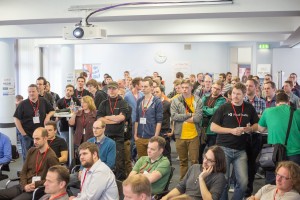
Blog

User Interface Guidelines for Mobile Devices: Blessing or Curse?

Corporate design guidelines aim at ensuring a coherent and consistent corporate identity. User interface guidelines (or UI guidelines) work in a similar fashion. They provide a set of rules for designing a software’s user interface. This applies to visual design as well as to interaction design. Ideally, adhering to these rules guarantees a basic quality of applications that run on the same operating system and avoids an “application zoo”-scenario.
read more…

Mouse vs. Touch – or Peacefully Together?

André Ihme
September 30th, 2010

Interacting via touch is on everyone’s lips. Nevertheless, many companies shy away from reorganizing their applications respectively, because touch screen interactions require different concepts and can accompany huge restructuring efforts and high costs. Also, such restructuring is not riskless, since touch-interaction is not the most suitable paradigm for all application scenarios. The following article presents the combo box as an example to illustrate how mouse- and touch-interaction concepts can be integrated to get the best of both worlds. The article aims at inspiring especially those of you, who appreciate mouse- and touch-operation alike.
read more…

The Comeback Of The Pie Menu

Justine Kiermasch
June 16th, 2010

In recent years, so called “natural user interfaces” (NUI) have grown in popularity. More and more often, interaction via touch and gestures is employed instead of using mouse and keyboard. The iPhone was greeted with great enthusiasm and played a major part in spreading touch screen system in the consumer market while also introduced gesture-based interaction in a playful way. There should be hardly any touch screen user who is not familiar with the pinch gesture that is used to resize or zoom images on the iPhone.
read more…

Resurrecting UI Prototypes (Without Creating Zombies) – Part 2: Prototyping with Expression Blend

Thomas Immich

Keeping the background information of the previous article in mind, assume you want to make use of Blend to design a NUI based on Silverlight or WPF that lets you easily manipulate items on the screen. In the beginning, you won’t even touch the tool at all – you “invent” whatever gesture you think is intuitive to perform this operation. Most likely you do this in your head or on the whiteboard. You discuss and refine the design with your team mates or with potential users. At this stage everything is still low-fidelity and throwing away things isn’t costly yet. As soon as you have a good-enough feeling about the rough design, you start prototyping with higher fidelity. This is to be really sure your idea works. To provoke the intended interaction experience, caring about every single detail is exceptionally important in later prototyping stages.

read more…

Resurrecting User Interface Prototypes (Without Creating Zombies) – Part 1: Prototyping Natural User Interfaces

Thomas Immich

Every user interface designer is familiar with the procedure to some extent: To find out what a user interface needs to look and behave like it’s certainly a good idea to create a prototype and evaluate it with potential users. Users will tell you what’s still nagging them and therefore should be improved before coding starts. So, in the beginning of any UI design process everything is about change – you create a prototype and already expect it to require modifications in order to work alright. As you – and most likely your client, too – want changes to be as cost-efficient as possible, you are better off taking a change-friendly prototyping method or tool. This is especially true in early stages of the project your ideas of potential solutions are rather vague. In this early phase, most often you don’t even know the exact problem for which you are in hunt of a solution. You are still analyzing more than you are designing.

read more…

Regarding Color Vision Deficiency in the Icon Design Process

David Patrizi
David Patrizi
December 7th, 2009

Red is not always red, green is not always green. For quite a large amount of people it is not easy to distinguish between red and green hues. About 6% of all males have the same difficulties to tell orange from olive-green as unaffected people have to distinguish between burgundy and ruby-red – oftentimes, it is impossible. This most common kind of color vision deficiency is called Deuteranomaly, also known as “green weakness”. The following article will deal with the question of how this wide-spread impairment impacts the production process of high quality icons.

read more…

Java in the Mobile Market: Google Android vs. JavaFX – Part 1: General Market Trends

Florian Moritz

Centigrade specializes in creating GUIs, in many projects with a particular focus on the implementation of Java Swing based GUIs for desktop applications. With the advancement of the mobile market, it is an obvious step for Centigrade to also have a look at Java based mobile GUIs. This article gives an overview on the mobile market today and includes a comparison of the two major Java players in that sector, Google Android and JavaFX.
read more…

Modern User Interface Design Tools – Part 3: Expression Blend vs. Flex Builder

David Patrizi
David Patrizi
June 26th, 2009

In the previous part I took a closer look at how and to what extent Microsoft Expression Blend and Adobe Flex Builder offer pixel-graphics and vector-graphics tools to enable GUI designers to create modern user interfaces. In addition I outlined the concept of 9-Slice-Scaling, a method to make pixel graphics scalable without any quality loss. In this last part of the series I’m going to give a short example of how the concept is implemented in both tools and finally provide an overall comparison of the two tools to point out their strengths and weaknesses.

read more…

Want to know more about our services, products or our UX process?
We are looking forward to hearing from you.

Senior UX Manager
+49 681 959 3110

Before sending your request, please confirm that we may contact you by clicking in the checkbox above.